- Preface
- The Data Set
- A First Look
- Releases over time
- Releases By Genre
- Styles
- Song Lengths
- Number of Tracks per Release
- Track Position and Track Length
- Artists and Gender Distribution
- Band Lifetimes
- Artists by Countries
- Final Plots
- Reflection
Preface
Most of this was written in early Spring 2017 when I was studying for a nanodegree in Data Science at Udacity. It is part of my submission for the Exploratory Data Analysis project for this degree, and as such puts more emphasis on exploration than on statistical testing. Furthermore, the tone of the writing is sometimes chosen to show-off particular features that are required parts of the analysis. The project required me to add some reflections at the end and pick favorite plots, which is why these sections exist. I really like the plots I have picked, so go take a look at them. There is a lot of text in this analysis, and you are invited to read it all. But it is also fine to simply scroll down and look at the beautiful (I think) plots. If you are not planning to question my methodology and dataset, then you can actually jump straight to Releases over time, since this is were the fun starts.
A note on the code
Also note that the code-snippets in between are in the R ‘programming language’. I make heavy use of pipes from magrittr (arguably more for my own amusement than for anyone’s sanity). I should especially point out that the syntax . %>% is used to define single-argument functions inline. And in case you are wondering – no, that’s not a good idea for production code, but in my freetime I am a huge fan of writing pointfree programs just to see how far one can take it. For my troublesome relationship with R, take a look at the reflection part at the bottom of the page.
The Data Set
Let us start with a discussion of the data set used in this analysis. This is a data set I have prepared myself. It consists of two files in tab-separated-values format, namely artists.tsv and release_groups_enhanced.tsv. These contain information on music artists and the albums, EPs, etc. released by them over the last couple of years. This data set was created as follows:
- First, I acquired a dump of the MusicBrainz database. It is available under a very permissive license and contains information about artists, labels, and their releases. I use the data released on March 11th, 2017.
- Next, I acquired a dump of the Discogs database, which is also available under a very permissive license. I use the data realased on Match 1st, 2017.
- Finally, data from both databases was combined to produce the output.
Information on Artists
The artists.tsv file contains the following columns in this order:
- MusicBrainz artist ID,
- name of the artist,
- founding year,
- parting year (only set if the artists has stopped existing),
- type, one of group, person, other,
- gender, one of m, f, o (other) only available for persons,
- description string to distinguish artists with the same name when manually inspecting the data,
- a value indicating whether this artist has ceased to exist (t if that is the case, f otherwise),
- subdivision of a country associated with the artist (ISO 3661-2). country associated with the artist (ISO 3661-1 and ISO 3661-3),
- semicolon-separated list of release IDs associated to this artist
This data comes from the MusicBrainz database exclusively. It only lists artists from the database that have releases associated to them, all other artists have been dropped. Missing information or dropped information is marked by \N.
Countries and Areas
The country and area for an artist have been determined as follows: The MusicBrainz database lists an associated area and founding (and parting) area for (some) artists. If the associated area is set, I used this to determine the area. Otherwise, I used the founding area. These area entries are generally of different resolutions. The database also specifies which areas are parts of other areas. This was used to determine for each area which subdivision of a country and which country are the most appropriate ones. The ISO 3661 standard gives short names for a lot of these countries (ISO 3661-1) and subdivisions (ISO 3661-2). All areas that have neither of the two were dropped when writing out the artist information. A few of the artists may have been founded in a now non-existent state. These use the codes from the ISO 3661-3 standard.
Founding and Parting Year
The founding year and parting year are limited to the range 1900 to 2017 (inclusive), all dates outside that range are dropped. Contrary to the MusicBrainz database, the parting date is only set if the artist has not been reunited. For persons, these two columns are to be understood as birth and death date.
Information on Releases
The release_groups_enhanced.tsv file contains the following columns in this order:
- MusicBrainz release group id,
- name of the release group,
- semicolon-separated list of ids of the contributing artists,
- type of the release (one of album, ep, or single),
- Dicogs master id (if available),
- semicolon-separated list of genres (see Discogs page about genres),
- semicolon-separated list of styles,
- semicolon-separated list of length of tracks on the release group in seconds,
- flags indicating whether there was a CD, Vinyl, Cassette, Digital, Other release (five columns),
- release date given as year, month, day (three columns)
Release vs. Masters and Release Groups
This data comes from two sources: The MusicBrainz database and the Discogs database. Both databases distinguish release groups (MusicBrainz) and masters (Discogs) from releases. A release group is the abstract idea of an album, single, or EP. The release is its manifestation, e.g., the release group Abbey Road is associated with many releases, such as the Spanish 1969 12” Vinyl release of the album etc. Masters are Discogs’ equivalent to release groups. In the following, where no confusion arises, we will use the terms release, release group, and master interchangably.
For this data set, I am only interested in official releases (the MusicBrainz database also lists unofficial ones) of album, EP, or single type. The track list is reduced to a list of lengths in seconds, possibly with missing entries marked by \N. The tracklist is generally taken from the earliest release, and only improved upon if there is a tracklist that agrees on all existing track lenghts but fills in some missing values.
Format Flags
The flags for the different formats where set whenever there was a release on that format at some point in time. So a 1920s album may in theory also have a digital version available.
Genre and Styles
The Discogs database was used to fill in further releases for some release groups (there are about ~100k entries that are affected by this), and also to give style and genre information for releases. Personally, this is something I thought would be most interesting, but MusicBrainz does not contain this data. The distinction between genre and style is not clear, though genres are generally less specific than styles.
Lack of Scores
Something that is missing from the data set are the user scores. These are only available to the public for MusicBrainz, and I generally found that there are too few items with a good number of scores to really make sense of it.
A First Look
Artist Data
Let us know take a first look at the data, beginning with the artists:
artists <- read.csv('artists.tsv',
sep = '\t',
quote = "",
na.strings = c('\\N')) %T>%
str
'data.frame': 317578 obs. of 11 variables:
$ id : int 805192 101060 220155 618464 388372 228311 407238 421011 1182563 998553 ...
$ name : Factor w/ 301169 levels "^","~▲†▲~","||| |||",..: 284395 261396 153472 226197 282899 81353 117067 71102 221515 22155 ...
$ beginyear : int NA 1956 NA NA NA NA 1992 NA NA NA ...
$ endyear : int NA 1993 NA NA NA NA NA NA NA NA ...
$ type : Factor w/ 3 levels "group","other",..: NA 1 NA NA 1 1 1 1 3 NA ...
$ gender : Factor w/ 3 levels "f","m","o": NA NA NA NA NA NA NA NA 2 NA ...
$ description: Factor w/ 48784 levels "","--","...",..: 1 45967 1 1 1 1 1 1 1 1 ...
$ ended : Factor w/ 2 levels "f","t": 1 2 1 1 1 1 1 1 1 1 ...
$ area : Factor w/ 770 levels "AD-07","AE-DU",..: NA NA NA NA NA NA NA NA NA NA ...
$ country : Factor w/ 205 levels "AD","AE","AF",..: NA 188 NA NA NA NA NA NA NA NA ...
$ releases : Factor w/ 317578 levels "1000010;1467812;1362305",..: 15544 180470 293759 286666 233638 200895 237525 240550 108175 59846 ...
As you can see, there are quite a lot of entries in this dataset. Also, generally a lot of information is missing. It might be necessary to restrict to certain subclasses of the data for any kind of interesting analysis.
For our purposes, I will not actually need the description column. Also, the ended field should be a boolean rather than a factor, and the releases should be given as an actual list.
levels(artists$ended) <- c(FALSE, TRUE)
artists$ended <- as.logical(artists$ended)
artists %<>% subset(select = -description)
artists$releases %<>% sapply(. %>% {strsplit(as.character(.), ';')})
head(artists)
id name beginyear endyear type
1 805192 WIK▲N NA NA <NA>
2 101060 The Silhouettes 1956 1993 group
3 220155 Love .45 NA NA <NA>
4 618464 Sintellect NA NA <NA>
5 388372 wecamewithbrokenteeth NA NA group
6 228311 Elvin Jones & Jimmy Garrison Sextet NA NA group
gender ended area country releases
1 <NA> FALSE <NA> <NA> 1068865, 1068866
2 <NA> TRUE <NA> US 183576, 1556132
3 <NA> FALSE <NA> <NA> 874365, 314552
4 <NA> FALSE <NA> <NA> 838648
5 <NA> FALSE <NA> <NA> 548659
6 <NA> FALSE <NA> <NA> 327945
Release Data
Now for the releases:
releases <- read.csv('release_groups_enhanced.tsv',
sep = '\t',
quote = "",
na.strings = c('\\N')) %T>%
str
'data.frame': 1032619 obs. of 16 variables:
$ id : int 11 12 13 28 60 271372 116 190 454 1370 ...
$ name : Factor w/ 826250 levels "`+`","^_^","~",..: 298281 132065 668426 506340 726784 175314 663909 639355 593613 495068 ...
$ artists : Factor w/ 385369 levels "1","10","1000",..: 27380 57213 27380 166968 228477 948 303685 59614 188827 380255 ...
$ type : Factor w/ 3 levels "album","ep","single": 1 1 1 1 1 1 1 1 1 1 ...
$ discogsid : Factor w/ 137345 levels "1000","10000",..: 90062 17569 69305 NA 112789 NA NA 60952 125826 13818 ...
$ genres : Factor w/ 2447 levels "","Blues","Blues;Classical",..: 1499 2101 1499 388 2066 388 1 517 1857 2101 ...
$ styles : Factor w/ 74265 levels "","Aboriginal",..: 15194 12839 69574 19261 45203 22655 1 8488 3808 8512 ...
$ tracks : Factor w/ 822666 levels "","0","0;0","0;0;0",..: 79096 724497 169074 337964 379842 658258 321671 120359 620963 485298 ...
$ hascd : int 1 1 1 1 1 1 1 1 1 1 ...
$ hasvinyl : int 1 1 1 0 1 0 0 0 1 1 ...
$ hascassette: int 1 0 1 0 1 0 0 1 1 1 ...
$ hasdigital : int 0 0 0 0 0 0 0 0 0 0 ...
$ hasother : int 0 1 0 0 0 0 0 0 0 0 ...
$ year : int 1996 1999 1995 1999 1993 2000 1998 1999 1986 1989 ...
$ month : int 6 NA 3 NA 5 NA NA 2 6 NA ...
$ day : int 4 NA 17 NA 1 NA NA 23 23 NA ...
That is quite a collection. It turns out that it is more convenient to have the flags for the different media be logical:
formats <- c('cd', 'vinyl', 'cassette', 'digital', 'other')
invisible(formats %>%
sapply(. %>%
{releases[[paste('has', ., sep='')]] %<>%
as.logical}))
We will not need the Discogs id. I mainly left it in the data to make it easy to enrich the dataset later on, if necessary. As before with releases I’d rather want proper lists for genres, styles, and tracks. Note that we have to put in some extra care here: Releases without track information have tracks set to the empty string, where as releases with a single track for which we do not know the length have a value of ‘\N’, which R interprets as NA.
releases %<>% subset(select= -discogsid)
releases$genres %<>% sapply(. %>% {strsplit(as.character(.), ';')})
releases$hasgenres <- sapply(releases$genres, length) > 0
releases$styles %<>% sapply(. %>% {strsplit(as.character(.), ';')})
releases$hasstyles <- sapply(releases$styles, length) > 0
releases$tracks %<>% sapply(. %>% {strsplit(as.character(.), ';')} %>%
lapply(., as.integer))
releases$tracks[is.na(releases$tracks)] <- list(NA)
releases$hastracks <- sapply(releases$tracks, length) > 0
head(releases)
id name artists type
1 11 Hot 11 album
2 12 Chore of Enchantment 12 album
3 13 The Inevitable 11 album
4 28 Piece and Love 26 album
5 60 Ultimate Alternative Wavers 44 album
6 271372 Devil's Brothers 100379 album
genres
1 Jazz
2 Rock, Folk, World, & Country
3 Jazz
4 Electronic
5 Rock
6 Electronic
styles
1 Dixieland, Swing, Ragtime
2 Country Rock, Lo-Fi, Folk Rock, Alternative Rock
3 Swing, Dixieland
4 Electroclash, Breakbeat, Industrial, Noise, Trip Hop
5 Indie Rock, Alternative Rock
6 Experimental, Dark Ambient
tracks
1 150, 232, 275, 170, 159, 144, 214, 188, 173, 192, 191, 228
2 48, 227, 194, 204, 62, 215, 209, 262, 240, 214, 287, 274, 405, 281, 287, 59
3 185, 187, 169, 207, 231, 165, 161, 139, 137, 193, 154, 180
4 228, 702, 244, 265, 229, 282, 272, 292, 235, 179
5 239, 231, 264, 506, 390, 348, 349, 192, 399
6 377, 650, 293, 311, 386, 327, 1080
hascd hasvinyl hascassette hasdigital hasother year month day hasgenres
1 1 1 1 0 0 1996 6 4 TRUE
2 1 1 0 0 1 1999 NA NA TRUE
3 1 1 1 0 0 1995 3 17 TRUE
4 1 0 0 0 0 1999 NA NA TRUE
5 1 1 1 0 0 1993 5 1 TRUE
6 1 0 0 0 0 2000 NA NA TRUE
hasstyles hastracks
1 TRUE TRUE
2 TRUE TRUE
3 TRUE TRUE
4 TRUE TRUE
5 TRUE TRUE
6 TRUE TRUE
If you are anything like me, even this short glimpse at the data should excite you: There is so much to find! Can we visualize the demise of the vinyl (and its partial resurrection)? Are tracks in a first position significantly longer than the average song on an album? What genre is most associated with long songs (something experimental, perhaps?) or short songs (Grindcore?)? What are the predominant genres per country? I will look into some of these questions down below.
Releases over time
We will first take a look at how many releases we have for each year. Now here are the number of releases per year:
# Creates a vector of ticks for a log-scale plots.
make_log_breaks <- function(base_breaks, steps) {
factor <- 10
output <- base_breaks
for (i in seq(length.out = steps)) {
output <- c(output, base_breaks * factor)
factor <- factor * 10
}
output
}
# A theme we are going to use for multiple plots:
year_theme = theme(axis.text.x = element_text(angle = 50,
size = 10,
vjust = 0.5)) +
theme(plot.title = element_text(size = 14,
face = "bold",
hjust = 0.5))
# Adds vertical lines indicating the quantiles of a given column. Useful for histograms.
make_quantile_lines <- function(col, ...) {
qs <- quantile(col,
probs = c(0.25, .5, .75),
names = FALSE,
na.rm = TRUE)
c(
geom_vline(aes_(xintercept = qs[2], color = 'Median'), ...),
geom_vline(aes_(xintercept = qs[1], color = 'Q1'), ...),
geom_vline(aes_(xintercept = qs[3], color = 'Q3'), ...)
)
}
ggplot(releases, aes(year)) +
geom_histogram(binwidth = 1,
na.rm = TRUE,
fill = 'white',
color = 'black') +
make_quantile_lines(releases$year,
linetype = 'dashed',
size = 1,
alpha = .6) +
labs(title = "Number of releases by year",
x = "Year",
y = "Count (log. scaled)") +
scale_x_continuous(limits = c(1900, 2017),
breaks = seq(1900, 2015, by = 10)) +
scale_y_continuous(trans = "log10",
breaks = make_log_breaks(c(10, 20, 50), 3)) +
year_theme
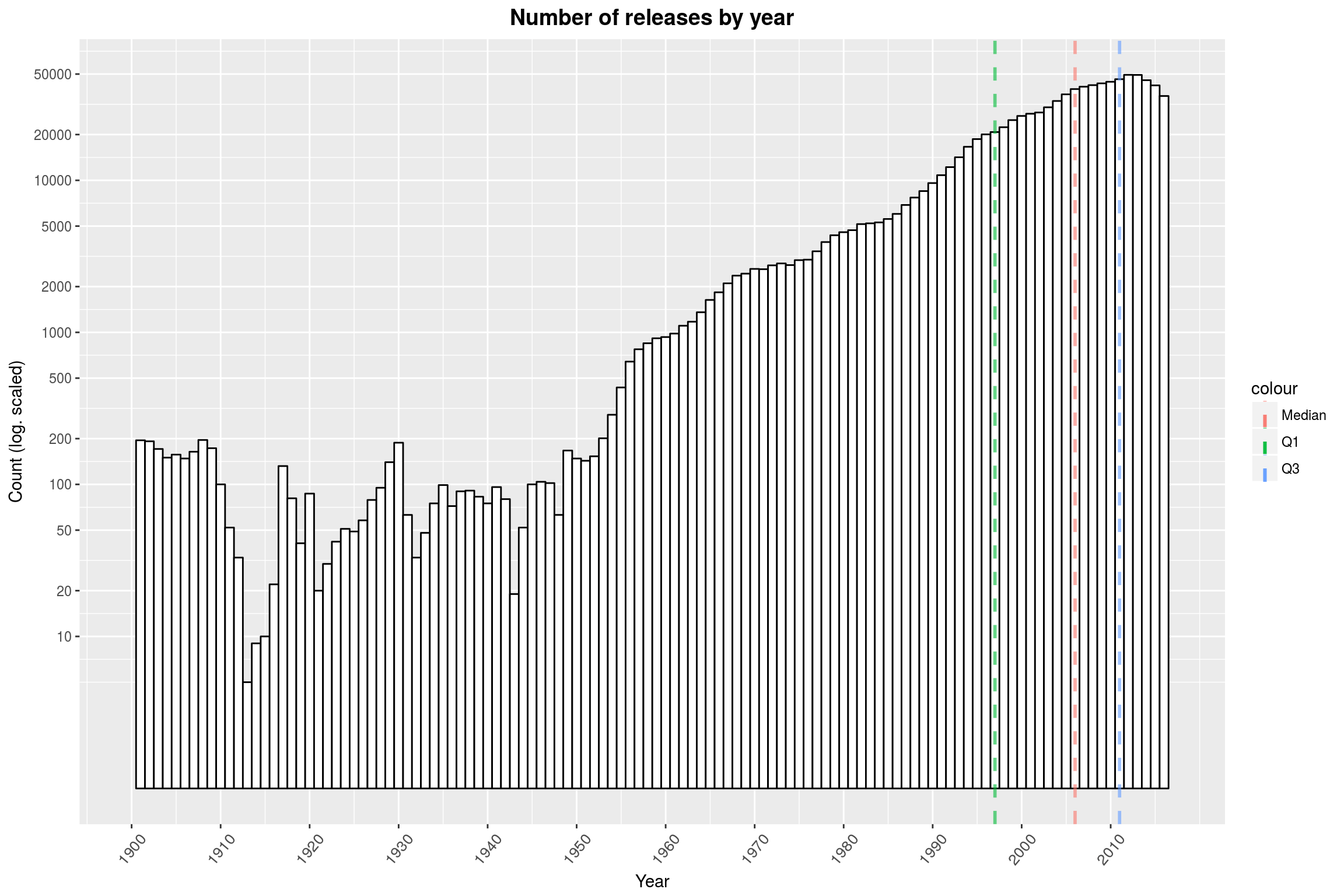
Note that the y-axis is log-scaled. It seems that the database consists mostly of releases from 1960 and later. Also, there is a slight dip in the end. There might be various reasons for the shape of the distribution:
- First off, we are only counting releases with a valid release date. Given that the databases were established in the 2000s, it is not surprising that release dates will be more likely to be available for more recent years.
- Similarly, it is rather unlikely that ancient releases are still available in some form.
- For the most recent releases on the other hand, there has only been comparatively little time for someone to enter them into the database.
- Finally, it seems likely that more music is produced now than ever before.
Let us quickly address the first point and see how many of the about one million rows we are actually loosing due to missing release dates:
releases %>% {nrow(.[is.na(.$year), ]) / nrow(.)}
[1] 0.0772647
About 8% – that’s not too bad.
Release Formats over time, relative
Next, let us take a look at the development of different formats over time. Specifically, we are going to look at the percentage of releases by year that support a given format at some point in time.
by_year <-
releases %>%
filter(!is.na(year)) %>%
group_by(year) %>%
summarise(cd = sum(hascd),
vinyl = sum(hasvinyl),
cassette = sum(hascassette),
digital = sum(hasdigital),
other = sum(hasother),
count = n())
make_relative_lines <- . %>%
sapply(. %>%
{geom_line(aes_q(y = interp(~x/count, x = as.name(.)), color = .))})
# or alternatively,
# function(column_names) {
# sapply(column_names,
# function(g) geom_line(aes_q(y = interp(~x/count, x = as.name(g)),
# color = g)))
# }
ggplot(data = by_year, aes(x = year)) +
make_relative_lines(formats) +
scale_y_continuous(breaks = seq(0, 1, by = .05)) +
scale_x_continuous(limits = c(1900, 2017),
breaks = seq(1900, 2017, by = 5)) +
labs(title = 'Fraction of releases with a given format',
y = 'Fraction',
x = 'Year') +
year_theme
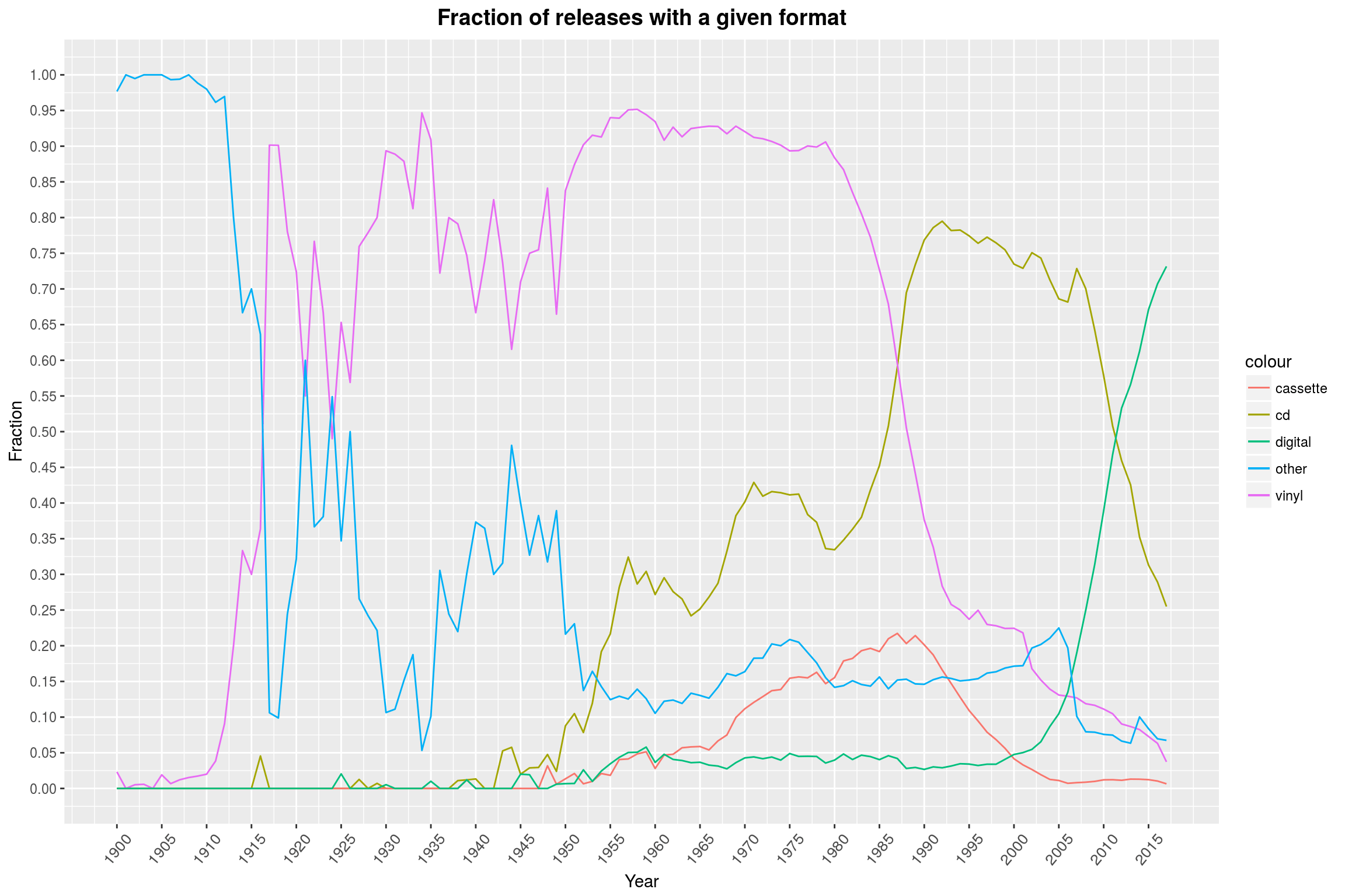
It is amazing to see how clearly this graph tells the story of the reign and eventual decline of the vinyl. The most surprising part, I think, is that less than half of the releases of the last few years are available on CD. Most of them are entirely digital, and I willingly assume that all of the recent releases available on CD are also available digitally, but not listed as such. This graph makes one wonder what the future will hold: Will digital releases see a decline in a favor of some new format? What might that be?
By the way, one might think that an area plot would be a more appropriate kind of plot, but the sum over the different formats for any point in time will in general not be 1, since a single release can have multiple formats. Another good option might be a violin plot, but I find that these make it hard to compare different classes.
Release Formats over time, absolute
I think it is interesting to look at the data in total numbers, instead of just percentages:
make_log_lines <- . %>%
sapply(. %>% {geom_line(aes_q(y = interp(~x+1, x = as.name(.)), color = .))})
ggplot(data = by_year, aes(x = year)) +
make_log_lines(formats) +
scale_y_continuous(trans = "log10",
breaks = make_log_breaks(c(10, 20, 50), 3)) +
scale_x_continuous(limits = c(1900, 2017),
breaks = seq(1900, 2017, by = 5)) +
labs(title = 'Total releases with a given format',
x = 'Year',
y = 'Count (log scaled)') +
year_theme
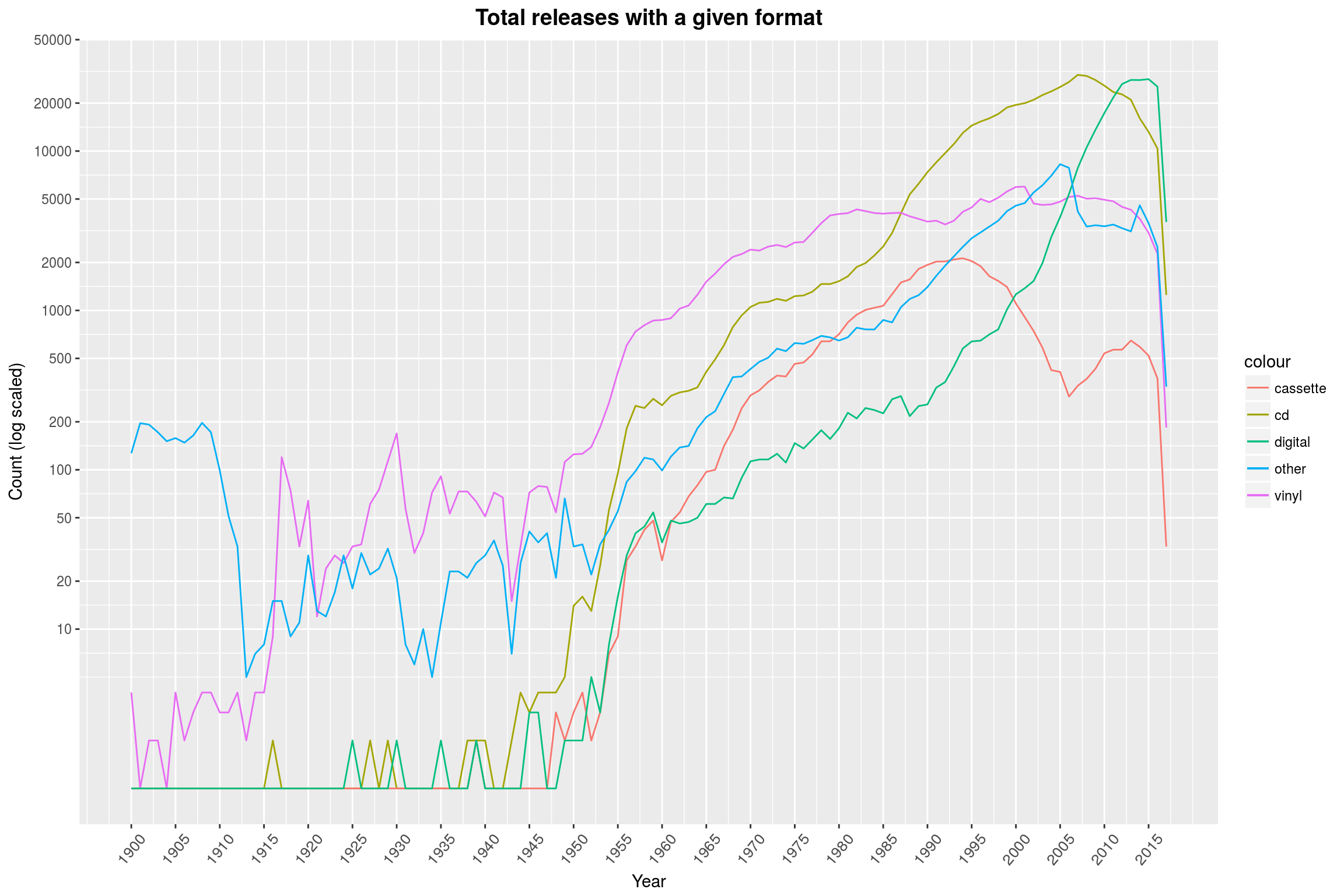
While the relative-view makes it seem that there are hardly any cassette releases left, there are people still pumping these out (same for vinyl). Tracking these down might be a fun exercise.
Also noteworthy is the steep dip in releases in 2016 and 2017. This is most likely because these releases are so recent, so people did not yet have the time to enter them into the databases. Also, specialist releases like Vinyl are sometimes only done after the initial release, so these may still be missing. This effect can also be witnessed in the histogram we looked at earlier (though less extreme), but naturally vanishes when looking at relative values as we did just a few minutes ago.
Releases By Genre
There are a few obvious things to look for with genres. First and foremost, one could look at the releases over time in specific genres. This is what we will start with.
genres <- releases$genres %>% unlist %>% unique
There are only a handful of genres:
genres
[1] "Jazz" "Rock"
[3] "Folk, World, & Country" "Electronic"
[5] "Pop" "Hip Hop"
[7] "Blues" "Reggae"
[9] "Funk / Soul" "Classical"
[11] "Non-Music" "Latin"
[13] "Stage & Screen" "Brass & Military"
[15] "Children's"
Since there are so few, we can introduce a new row for each genre and tag each release appropriately. Note that a release may have more than a single genre.
releases_per_year_and_genre <- releases %>%
filter(!is.na(year) & hasgenres) %>%
group_by(year) %>% {
# count genre releases per year
genre_releases_per_year <- do(., unlist(.$genres) %>%
table %>%
as_data_frame) %>%
spread_('.', 'n', fill = 0)
# now compute the number of releases with genres per year
releases_per_year <- group_by(., year) %>%
count %>%
set_names(c('year', 'count'))
genre_releases_per_year %>%
left_join(releases_per_year) %>%
ungroup
}
I am doing quite a lot to ensure that MusicBrainz releases get matched up with Discogs releases correctly, but that still ‘only’ leaves us about 400k releases with genres:
nrow(releases %>% filter(hasgenres))
[1] 396162
Finally, we can reap the benefits and look at some colorful plots! We plot the fraction of releases in a given year that were tagged with a genre (this yields a rather broken plot, read on for the real deal):
ggplot(data = releases_per_year_and_genre, aes(x = year)) +
make_relative_lines(genres) +
scale_y_continuous(breaks = seq(0, 1, by = .05)) +
scale_x_continuous(limits = c(1900, 2017),
breaks = seq(1900, 2015, by = 5)) +
labs(title = 'Fraction of releases with a given genre',
y = 'Fraction',
x = 'Year') +
year_theme
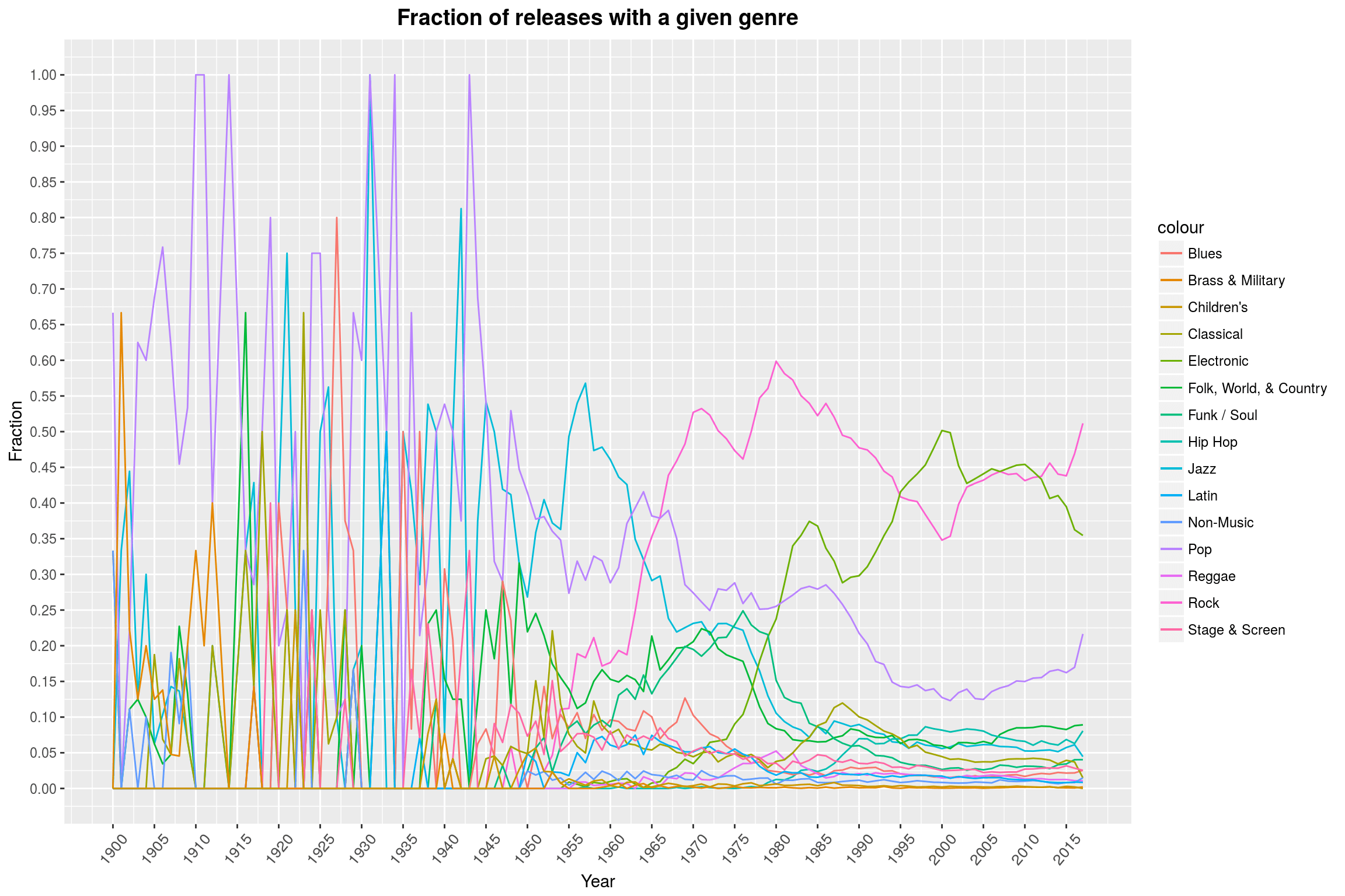
It seems that there is not really a lot of data available prior to 1955, so let’s drop that part (there are only 37 datapoints available for that timeframe). Furthermore, it seems to me that we should restrict ourselves to a subset of genres; the first 7 in our list seem like a good choice:
ggplot(data = releases_per_year_and_genre, aes(x = year)) +
make_relative_lines(genres[1:7]) +
scale_y_continuous(breaks = seq(0, 1, by = .05)) +
scale_x_continuous(limits = c(1955, 2017),
breaks = seq(1955, 2017, by = 5)) +
labs(title = 'Fraction of releases with a given genre',
y = 'Fraction',
x = 'Year') +
year_theme
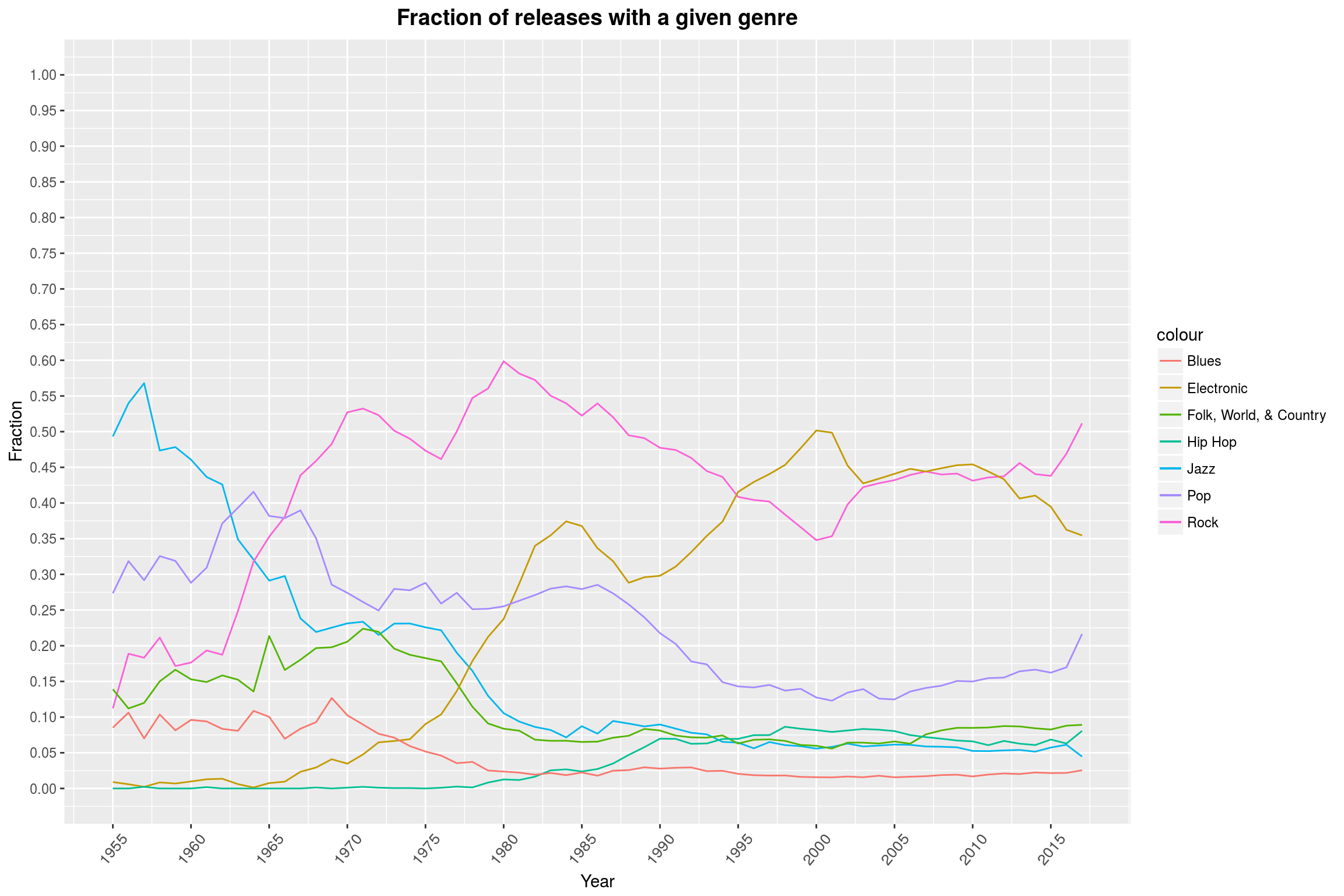
In the plot of the remaining data, we can clearly see that Rock music enjoys continued popularity, though there was a short surge of Electronic music durng the nineties and early 2000s. The decline of Jazz in the late 50s is also well visible. Actually, almost all other genres seem to have become less relevant with the rise of modern Rock music (more on that in a second!). Personally, I find the low percentage of Pop releases a bit surprising.
One has to keep in mind that the effects we see here may very well be artifacts of the way these databases work: Since Discogs does not want its database to be too cluttered with all kinds of different genres, the Rock genre contains a plethora of different subgenres. For example, it covers both Soft Rock (Coldplay) and Black Metal (say, Negator) as styles. Therefore, it is quite broad as a genre. I am somewhat willing to believe that something similar is true for Electronic. Additionally, for genres such as Heavy Metal, I’d expect that there are plenty of people who have made it their life’s task to correctly label and classify all the music they know. Maybe that is not quite the case for Pop music. Seen from a different perspective, I can also imagine that the expectation to see more Pop in such a graph is just caused by the massive success of a few artists and the omnipresence of (mostly older) Pop songs on the radio.
Anyway, I said we would also look at whether the rise of modern Rock music was immediately detrimental to the other genres. The graph above makes it seem like it did, but the fact that the relative fraction of releases classified as, say, Pop declined may also be due to the fact that there are just more releases in total:
ggplot(data = releases_per_year_and_genre, aes(x = year)) +
make_log_lines(c(genres[1:7], 'count')) +
scale_y_continuous(trans = "log10",
breaks = c(make_log_breaks(c(10, 20, 50), 2))) +
scale_x_continuous(limits = c(1955, 2015),
breaks = seq(1955, 2015, by = 5)) +
labs(title = 'Releases by genre over the years',
y = 'Count (log. scaled)',
x = 'Year') +
year_theme
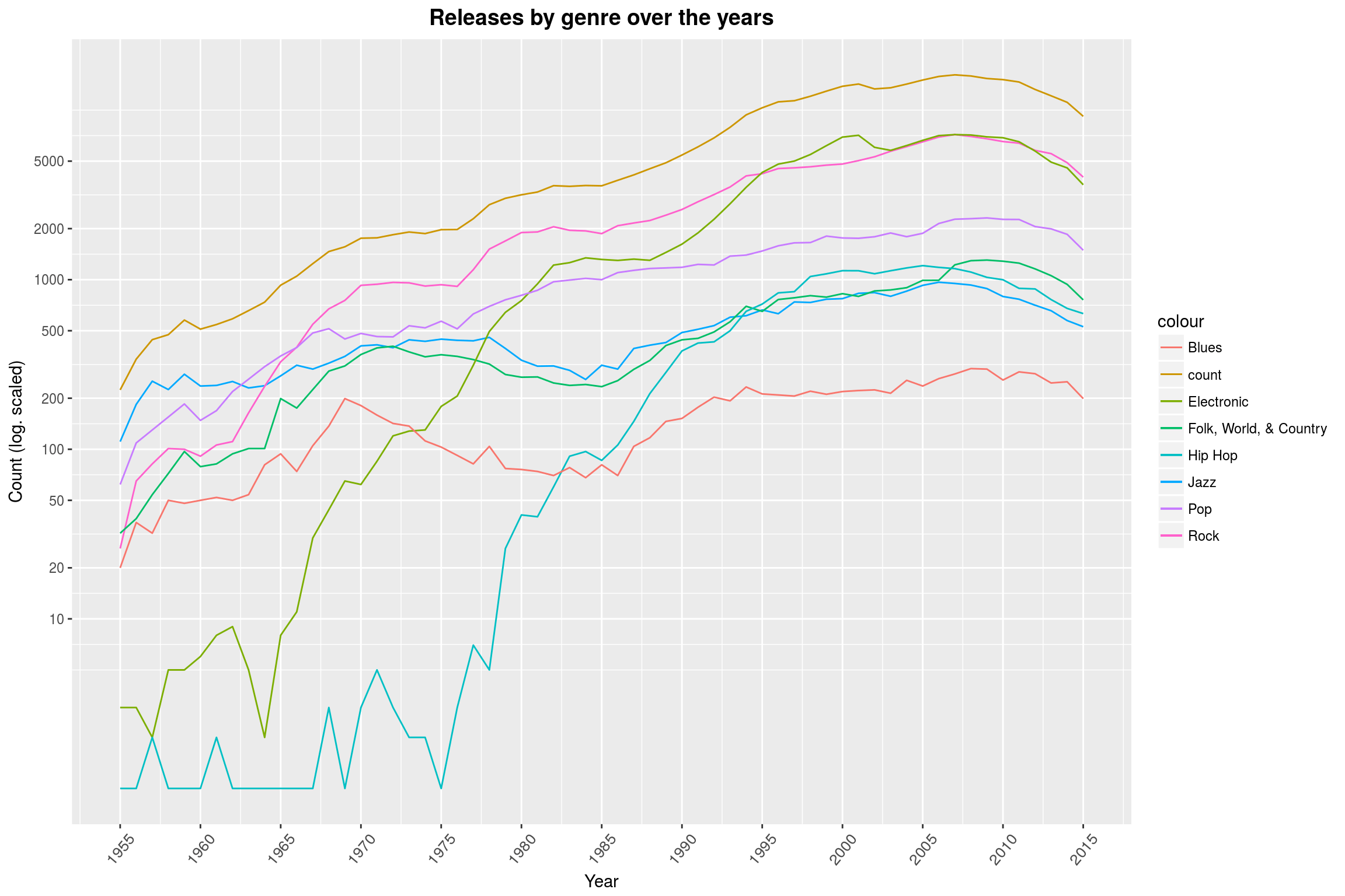
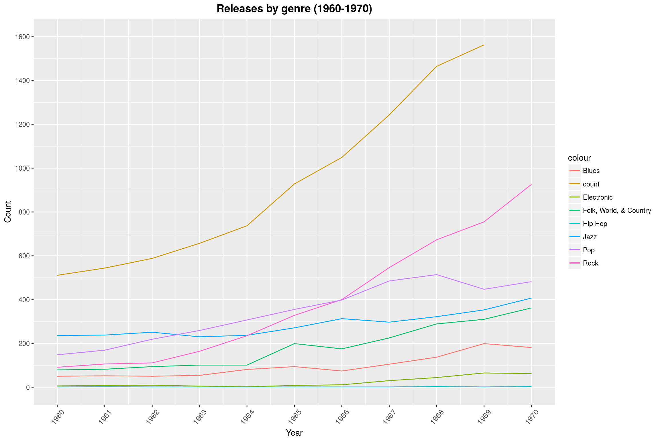
(Note that we took our earlier lesson to heart and removed all releases after 2015.) This graph shows that Rock music mostly caused more releases to come out, without greatly reducing the number of Pop releases. The log-scale is a bit misleading when it comes to slopes: Looking at the range from 1962 to 1970, it looks like the number of Rock releases grew more than the total number of releases (which may mean that releases from that area were often tagged with multiple genres), denoted in the graph by count. That, however, is not really the case as a linear plot shows:
ggplot(data = releases_per_year_and_genre, aes(x = year)) +
make_log_lines(c(genres[1:7], 'count')) +
scale_y_continuous(breaks = seq(0, 2000, 200),
limits = c(0, 1600)) +
scale_x_continuous(breaks = seq(1960, 1970, 1),
limits = c(1960, 1970)) +
labs(title = 'Releases by genre (1960-1970)',
y = 'Count',
x = 'Year') +
year_theme
Genre Popularity
Another way to look at this data is with an area plot. This subset of the data has the same problem we already encountered earlier: Any release may have multiple genres, so the fractions for each genre will not add up to one. We can mitigate that by taking the number of tags as our total instead of the number of releases. This is slightly more difficult to interpret, but it conveys the general message of the dataset pretty well and is easier to read than the lineplot (at least when all 15 genres are considered at once).
col_idx <- function(df, name) {
which(names(df) == name)
}
releases_per_year_and_genre %>%
gather(genre, value, sapply(genres, Curry(col_idx, df = .))) %>%
select(-count) %>%
group_by(year) %>%
# this last part here is *evil*. It contains the name 'value' three times:
# The first one is the name of the new column that we are making.
# The second one is the value of one sample, stating, for example, that
# there is one Jazz release in 1917.
# The third one is in the context of 'sum' and hence denotes the column
# 'value', and the sum yields the sum over rows with that year.
mutate(value = value / sum(value)) %>%
# now plot the data
ggplot(aes(x = year, y = value, fill = genre)) +
geom_area(color = 'black', alpha = .7) +
scale_x_continuous(limits = c(1955, 2017),
breaks = seq(1955, 2017, 5)) +
labs(title = 'Relative frequency of genres by year',
y = 'Fraction',
x = 'Year') +
year_theme
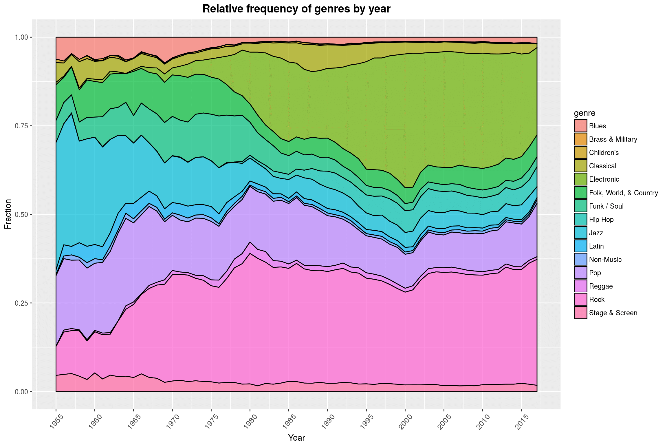
Something that I did not notice before is that with our data we can actually witness the genesis of Hip-Hop pretty clearly: The late 70s/early 80s are pretty accurate. According to Wikipedia, “Prior to 1979, recorded hip hop music consisted mainly of PA system recordings of parties and early hip hop mixtapes by DJs. […] The first hip hop record is widely regarded to be The Sugarhill Gang’s”Rapper’s Delight“, from 1979.” Since we began by filtering out any unofficial releases, these early pre-1979 recordings were most likely purged from our dataset.
In a way, this plot makes me wonder whether it is such a good idea to lump together so many subgenres under Rock while keeping Brass & Military separate (you can hardly even see the area!). So how many releases are there in each category, and did we only exclude all that fancy Brass & Military music because we filtered out releases without a year attached to them (which would be very surprising, since we are only missing less than 8% of the rows)?
Editorial note: The heading of this plot is misleading. It should rather be: Number of releases per genre, split by whether the release date is missing.
releases %>%
filter(hasgenres) %>%
group_by(is.na(year)) %>%
do(.$genres %>%
unlist %>%
table %>%
as_data_frame) %>%
set_names(c('hasyear', 'genre', 'count')) %>%
# do the actual plotting
ggplot(aes(x = genre, y = count, fill = hasyear)) +
geom_bar(position='dodge', stat = 'identity') +
labs(title = 'Number of releases per genre,\nsplit by whether the release date is available',
x = 'Genre',
y = 'Count') +
year_theme +
theme(axis.text.x = element_text(angle = 90, size = 10, vjust = 0.5))
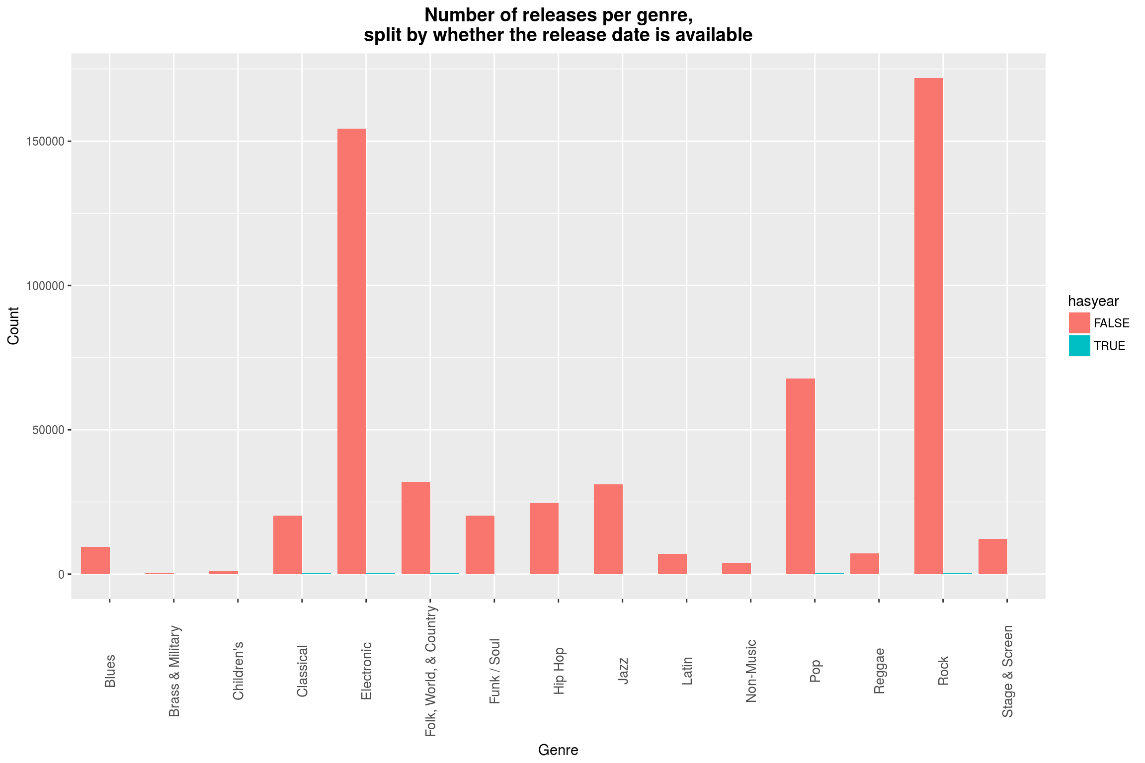 One might say that it is ironic that I have chosen a linear scale instead of a logarithmic scale here, but the former a) really shows how irrelevant the missing data is for any analysis of genres and b) shows the dominance of Electronic and Rock music.
Styles
Besides the rather broad genres, the data also comes with quite specific styles. They are probably too numerous to really have them all in one plot, so maybe it is a good start to look for the most used styles in the dataset. One thing I really liked about one of the previous graphs was that you could so clearly see the year that Hip Hop emerged (commercially). It would be neat to have a chart that collects for each style the first year that this style was used in. Interestingly, this would require a one-dimensional plot, so let’s see what we can come up with.
Now let’s look at the different styles we have:
styles <- releases$styles %>% unlist %>% unique
str(styles)
chr [1:468] "Dixieland" "Swing" "Ragtime" "Country Rock" ...
468 different styles! A release generally has multiple styles, as is the case with genres. So if your favorite is missing, do not despair: It can probably be made as a clever composite style. Now what are the top-performers here?
top_styles <- releases$styles %>%
unlist %>%
as_data_frame %>%
group_by(value) %>%
count %>%
arrange(desc(n)) %>%
set_names(c('style', 'count'))
head(top_styles)
# A tibble: 6 × 2
style count
<chr> <int>
1 Experimental 28265
2 Pop Rock 26709
3 Alternative Rock 25314
4 Indie Rock 24074
5 House 21548
6 Ambient 20985
Quite a surprise to see Experimental ranked first. Maybe fans of experimental music are more likely to enter their favorite music into a database, or experimental is a catch-all term for music made by people who have no idea on how to make music.
Anyway, I’d like to see some stats on the counts to decide whether it makes sense to even try to plot all of them in a meaningful way or whether there are some styles that are not really used anyway:
summary(top_styles$count)
Min. 1st Qu. Median Mean 3rd Qu. Max.
1.0 44.0 280.5 1783.0 1502.0 28260.0
Hm. Maybe we can first take a look at the top 50:
top_styles[1:50,] %>%
ggplot(aes(x = reorder(style, -count), y = count)) +
geom_bar(stat = 'identity', color = 'black', aes(fill = count)) +
scale_fill_distiller(palette = "Blues") +
labs(title = 'Frequencies of the 50 most common styles',
x = 'Style',
y = 'Frequency') +
year_theme +
theme(axis.text.x = element_text(angle = 90, size = 12, vjust = 0.5))
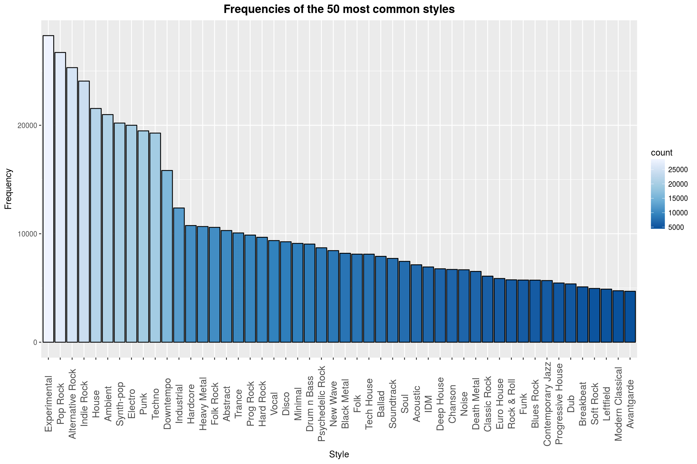
This plot looked totally dull before I added the color. It is much better now. Maybe that could be a useful tool actually! Wait a second, I have an idea…
make_hlines <- function(intercepts, ...) {
sapply(intercepts, . %>% {geom_hline(aes_q(yintercept = .), ...)})
}
make_vlines <- function(intercepts, ...) {
sapply(intercepts, . %>% {geom_vline(aes_q(xintercept = .), ...)})
}
top_styles %>%
ggplot(aes(x = reorder(style, -count), y = count)) +
geom_bar(stat = 'identity', aes(fill = log10(count)), width = 1) +
scale_fill_distiller(palette = "Spectral") +
scale_y_continuous(trans = 'log10',
breaks = make_log_breaks(c(5, 10, 20), 3)) +
labs(title = 'Frequencies of all styles, sorted',
x = 'Style',
y = 'Frequency (log. scaled)') +
year_theme +
theme(axis.text.x = element_blank()) +
make_hlines(make_log_breaks(c(5,10, 20), 3),
linetype = 'dashed',
alpha = .2) +
(nrow(top_styles) %>%
{c(. / 4, . / 2, 3 * . / 4)} %>%
make_vlines(linetype = 'dashed',
alpha = .2))
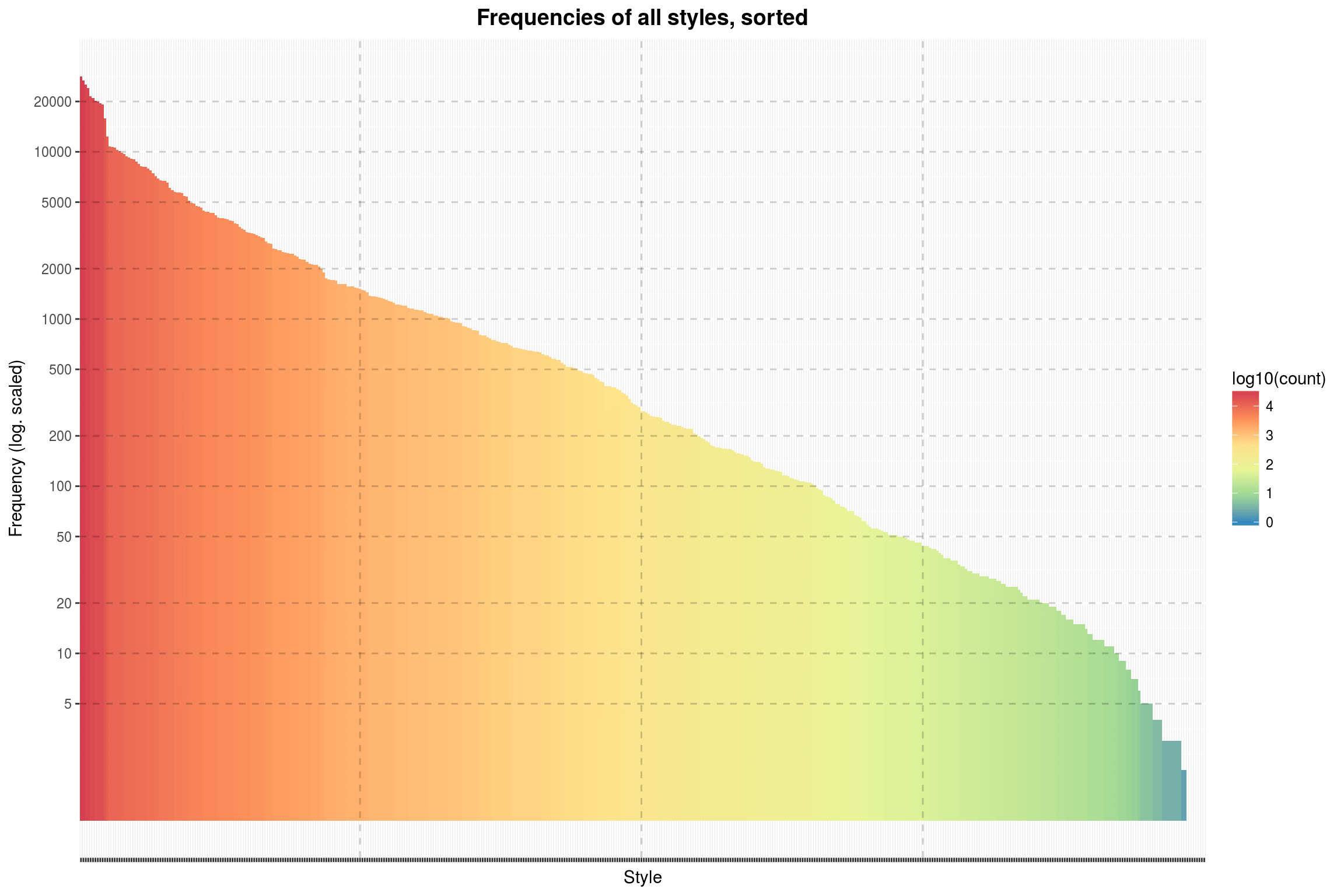
There we go. This gives a better idea of the total distribution of styles. Apparently, there are some styles that are hardly used at all in the dataset. Is this a failure on Discogs side?
tail(top_styles)
# A tibble: 6 × 2
style count
<chr> <int>
1 Jibaro 1
2 Kaseko 1
3 Luk Thung 1
4 Motswako 1
5 Philippine Classical 1
6 Piobaireachd 1
Well, probably not. These styles found here are just so niche that there will inevitably be few albums tagged as such, and those that are are probably missing the information that allows us to link Discogs entries with MusicBrainz records because they are so obscure. Also, many of them are far-eastern styles, for which I do not expect to see many entries in a database that is primarily aimed at English-speaking users.
Styles and their Lifetimes
As I promised above, we are now looking into the time ranges that different styles were used in. To this end, we first collect the first and last year that each style has been used in. (I thought that would be more interesting than just taking the first year it appeared.)
top_styles <- releases %>%
filter(hasstyles & !is.na(year)) %>%
rowwise %>%
do(
data_frame(year= .$year, style=unlist(.$styles))
) %>%
ungroup %>%
group_by(style) %>%
summarise(min_year = min(year), max_year = max(year)) %>%
mutate(range = max_year - min_year + 1) %>%
right_join(top_styles, by = 'style')
This data can now be used to draw a line for each style’s time range. 400+ such lines would be a bit overkill, so we again focus on the more popular styles.
make_style_year_plot <- function(num_entries, name_list) {
styles_for_plot <- name_list %>% left_join(top_styles, by = 'style')
# make the line marking the years that a style was used in
make_style_year_line <- . %>% {
name <- styles_for_plot[., ]$style
xmin <- styles_for_plot[., ]$min_year
xmax <- styles_for_plot[., ]$max_year
geom_errorbarh(aes_q(xmin = xmin, xmax = xmax, y = ., x = xmin))
}
# make the labels for the lines
make_label <- . %>% {
name <- styles_for_plot[., ]$style
xmin <- styles_for_plot[., ]$min_year
geom_text(aes_q(x = xmin-1,y = ., label = name),
hjust = 1,
size = 3.5)
}
num_entries %>%
{
ggplot() +
scale_x_continuous(limits = c(1890, 2017),
breaks = seq(1900, 2017, 5)) +
scale_y_continuous(limits = c(0.5, . + .5),
breaks = c()) +
sapply(1:., make_style_year_line) +
sapply(1:., make_label) +
year_theme +
labs(x = 'Years',
y = 'Styles')
}
}
make_style_year_plot(50, top_styles %>% select(style)) +
labs(title = 'Ranges for the 50 most common styles')
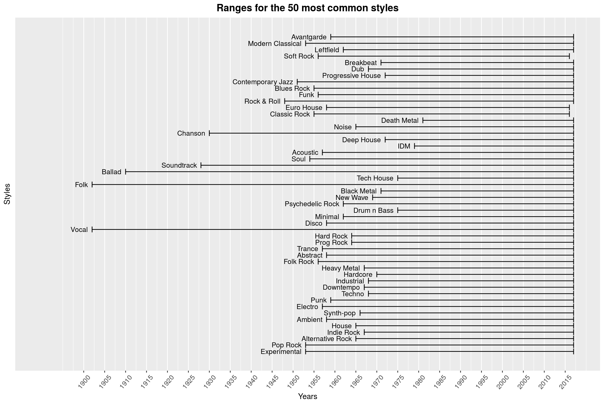
(That plot is missing some color, but I am not quite sure how to add it in a meaningful way.) While I think that this is an interesting way to look at the times in which styles emerged, there are some flaws with this approach: If you know anything about the history of Black Metal, you will be surprised to hear that there are 1970s Black Metal releases (which is what this plot claims). This genre only emerged in the 1980s; the album Black Metal by Venom that actually coined the term was not released until 1982. Of course, in retrospect it is easier to go back in time and label earlier albums with a similar sound as Black Metal. ‘Maybe’, you argue, ‘you are confusing a musical style with a term used to describe that style.’ Yes, maybe. (With Black Metal, this is a difficult discussion anyway: Our modern notion of Black Metal mostly refers to Norwegian Black Metal, which wasn’t a thing until the 1990s second wave of Black Metal.) In related matters, Why is Black Metal even in the top 50 of most common styles?
It might also be fun to see the styles that have the longest time ranges:
make_style_year_plot(50, arrange(top_styles, desc(range)) %>% select(style)) +
labs(title = 'Ranges for the 50 styles with the longest time in use')
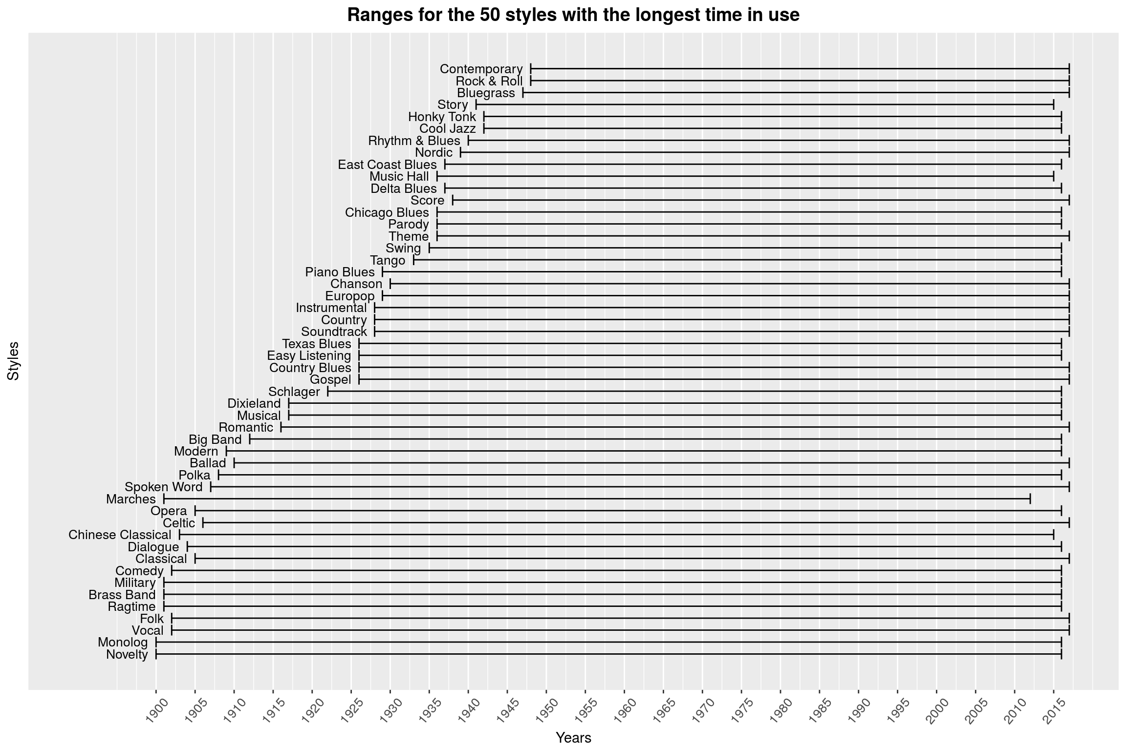 Amusingly, the oldest of the styles is called Novelty.
Many of these grandpa styles sounds like they are hardly popular anymore. One could use a violin plot to see when the bulk of releases in these styles happened, but having 50+ violin plots is probably not all that helpful. One thing I really like about this dataset is that the questions are really just jumping out at you: We could investigate periods of apparent musical creativity (in which years did the most genres arise), or we could try to summarise the popularity of a style in a single point and plot that as a point cloud. That, however, would only make sense if the graphs were interactive in some way, so you could hover a point to see what style that is.
Styles by releases per year
Let’s start with something simpler, namely the question in how far the range in year that a specific style is used correlates with the total number of releases with that style. Intuitively, there should be some connection. Also, it might be a good exercise to get the interactivity going.
p <- ggplot(data = top_styles, aes(x = range, y = count)) +
geom_point(aes(text = style, color = min_year)) +
geom_smooth() +
scale_y_continuous(breaks = make_log_breaks(c(10, 20, 40), 3),
trans = 'log10') +
scale_x_continuous(breaks = seq(0, 120, 5)) +
labs(title = 'Number of releases by time in use per genre',
x = 'Years in use', y = 'Number of releases (log. scaled)',
color = 'Year of first release') +
year_theme
ggplotly(p)
(You can hover over single data points to see what styles they represent.) That looks like a pretty solid correlation. Note that the number of releases is log-scaled. A quick calculation of the correlation coefficient confirms that impression:
top_styles %>% {cor(.$range, log10(.$count))}
[1] 0.4454488
It is, however, noteworthy that the oldest styles (on the right in the plot) defy this ‘exponential law’. This is probably because the number of releases before the advent of LP vinyls in the late 1940 was comparatively small to begin with. One of the advantages of this new format was that it could store much more music per side (20+ minutes instead of just 5!), which (I suppose) probably made music more affordable to everyone. This is incidentally also where the term album comes from: When every vinyl disc only holds 5 minutes per side, you literally need an album to store the discs for a single release.
Something that probably is not a problem here but should still be kept in mind is that the range statistic that we are using is highly sensitive to outliers – a single release with a wrong style could completely destroy any meaning that we associate with the range.
The older styles could also point to a more general pattern: Maybe styles simply saturate after ca. 50 years of existence and die off. Take a look:
p <- ggplot(data = top_styles[top_styles$range<65,],
aes(x = range, y = count)) +
geom_point(aes(text = style, color = min_year)) +
geom_smooth() +
scale_y_continuous(breaks = make_log_breaks(c(10, 20, 40), 3),
trans = 'log10') +
scale_x_continuous(breaks = seq(0, 120, 5)) +
labs(title = 'Number of releases by time in use per genre',
x = 'Years in use',
y = 'Number of releases (log. scaled)',
color = 'Year of first release') +
year_theme
ggplotly(p)
That is a tempting theory: There are some genres that simply do not offer much variation and saturate at a much lower release count than other genres. Fortunately, the interactivity of the chart allows us to check out some of these low-performers: For example, one of the datapoints in the bottom right is Volksmusik, i.e. traditional German folk music. Certainly, there have been more than 10 releases in that style over the last 60 years. The regionality of this genre makes it unlikely for them to find their way into these databases, especially since the stereotypical Volksmusik fan does not enjoy the benefits of a high speed internet connection.
Genesis of Styles - Times of Creativity
On to the next question: What times were especially creative, musically? For this, we are going to look at the number of new styles by years:
ggplot(data = top_styles, aes(x = min_year)) +
geom_histogram(color = 'black',
fill = 'white',
binwidth = 5) +
make_quantile_lines(top_styles$min_year,
linetype = 'dashed',
size = 1, alpha = .6) +
scale_x_continuous(breaks = seq(1900, 2017, 5)) +
scale_y_continuous(breaks = seq(0, 80, 5)) +
labs(title = 'Genesis of new styles over time',
x = 'Year',
y = 'Number of new styles') +
year_theme
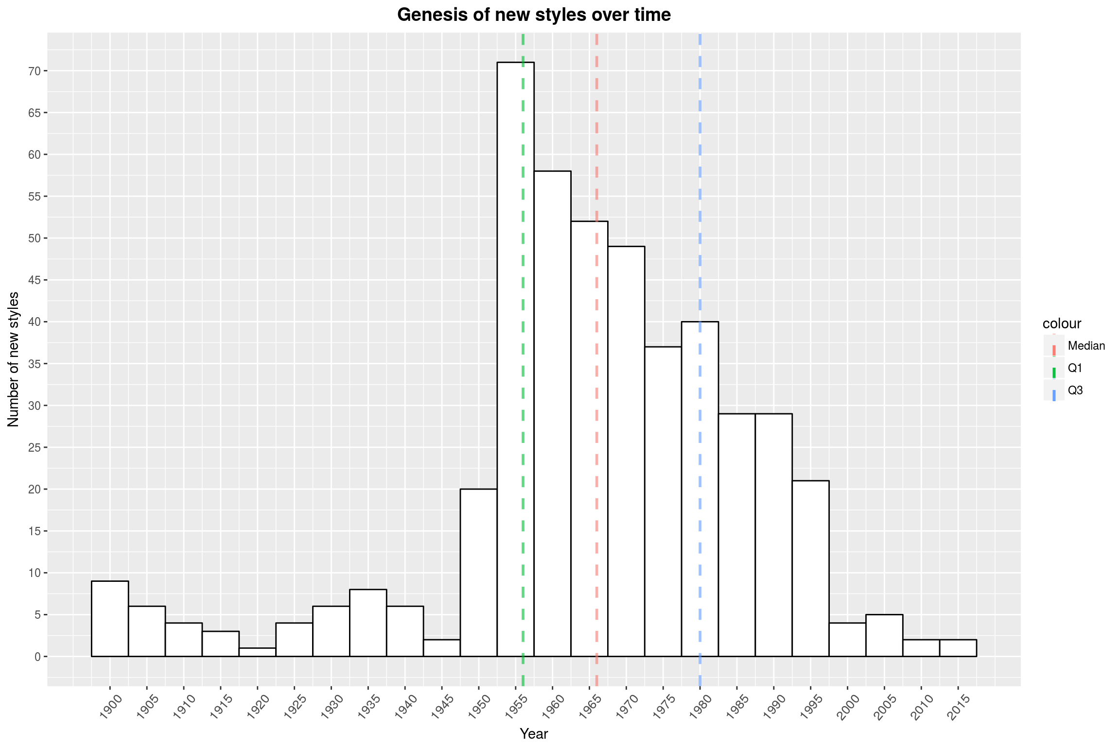
As so often with this data set, the 50s are where it all starts (remember the LP vinyl release 1949?). From there on, the number of new styles slowly declines until almost hitting 0 in recent years. There are a couple of reasons for this: First, Discogs is very selective when it comes to new styles (since there are already so many). Secondly, a style may only be recognized as such after a few years of activity. Third, maybe all of the obvious low-hanging fruits have been claimed. Let’s look at some of the more recent new styles:
top_styles %>% filter(min_year >= 2000) %>% .$style
[1] "Witch House" "Juke" "Bassline"
[4] "Skweee" "Harsh Noise Wall" "Nitzhonot"
[7] "Bongo Flava" "Kaseko" "Luk Thung"
[10] "Motswako" "Philippine Classical"
Some of these are mere artifacts, such as Kaseko& (which is more appropriately associated with the 70s), *Luk Thung, and Philippine Classical. Skweee on the other hand is a real thing and describes a Swedish kind of modern funk. You never stop learning.
Release distributions over time by subgenre
Ok, I know I announced that we might try to find the one point where each genre was most popular and plot that as a cloud. But I am not really convinced that this is a good idea. My main gripe with the previous visualisation was that the origin of Black Metal was completely off. Let’s just focus on Metal subgenres and look at some violin plots instead.
# collect the number of releases with each style by year
releases_per_stlye_and_year <- releases %>%
filter(hasstyles & !is.na(year)) %>%
group_by(year) %>%
do(unlist(.$styles) %>%
table %>%
as_data_frame
) %>%
set_names(c('year', 'style', 'count')) %>%
# Add the total for each style. That's kind of stupid to have in each row,
# but this is the only way to please the gods of ggplot2
# (other than sacrificing a new born kitten, which is not available to me).
group_by(style) %>%
mutate(total = sum(count))
make_style_violin_plot <- function(data, absolute) {
scaling = ifelse(absolute, 'area', 'width')
data %>%
# filter out anything beyond 2015 as discussed before
filter(year < 2016) %>%
# make the violin plots
ggplot(aes(x = reorder(style, style), y = year, weight = count)) +
geom_violin(draw_quantiles = c(0.25, 0.5, 0.75),
scale = scaling,
adjust = 0.15,
aes(fill = style)) +
geom_label(aes(x = reorder(style, style),
y = 2016,
label = total,
fill = style),
color = 'white',
fontface = 'bold',
hjust = 0) +
coord_flip() +
scale_y_continuous(breaks = seq(1900, 2015, 2),
limits = c(range(data$year)[1], 2018)) +
year_theme +
theme(axis.text.x = element_text(angle = 90, size = 10, vjust = 0.5),
legend.position = 'none')
}
make_style_violin_plot_by_regex <- function(style_search, absolute) {
releases_per_stlye_and_year %>%
filter(grepl(style_search, style)) %>%
make_style_violin_plot(absolute)
}
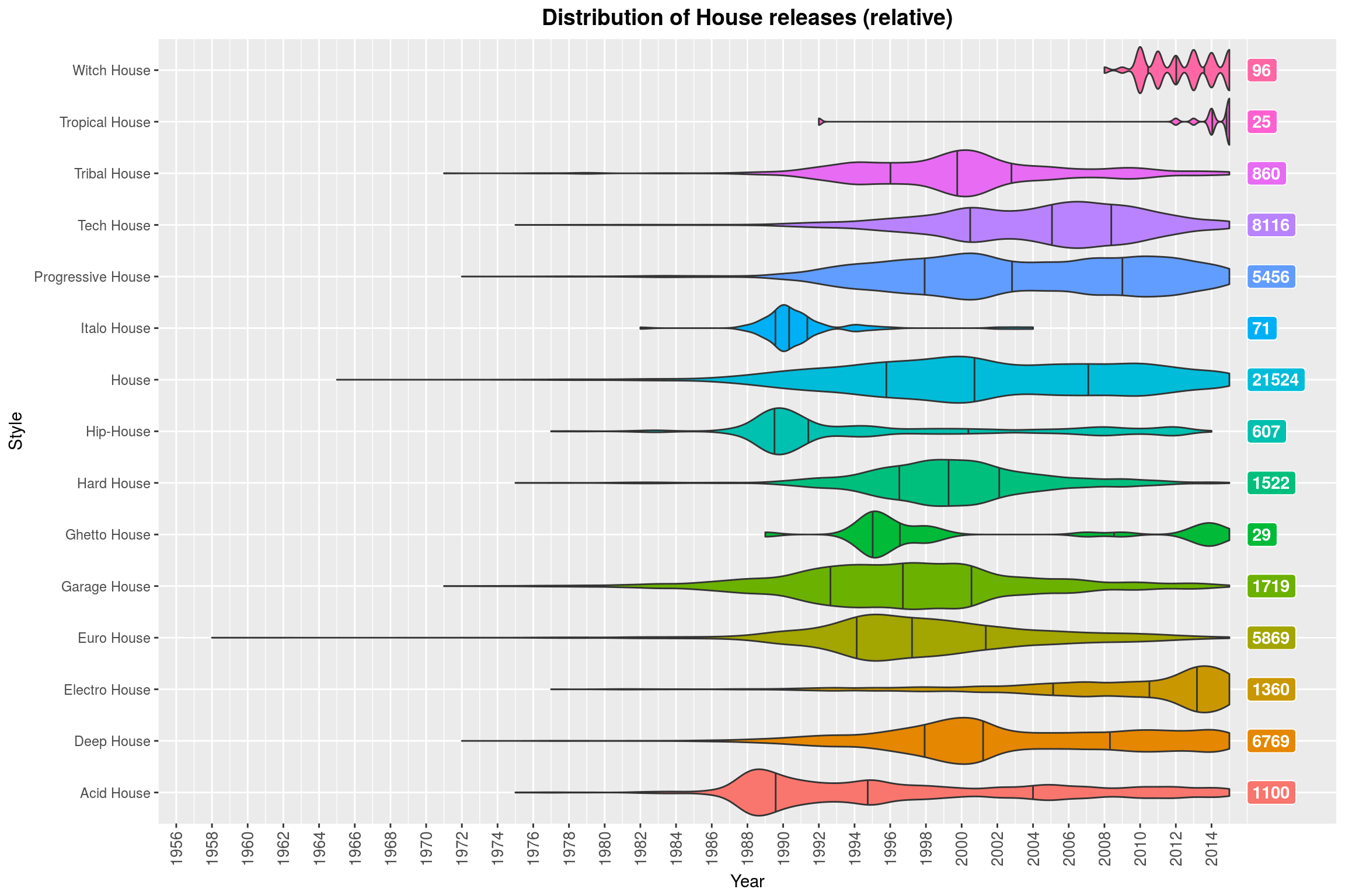
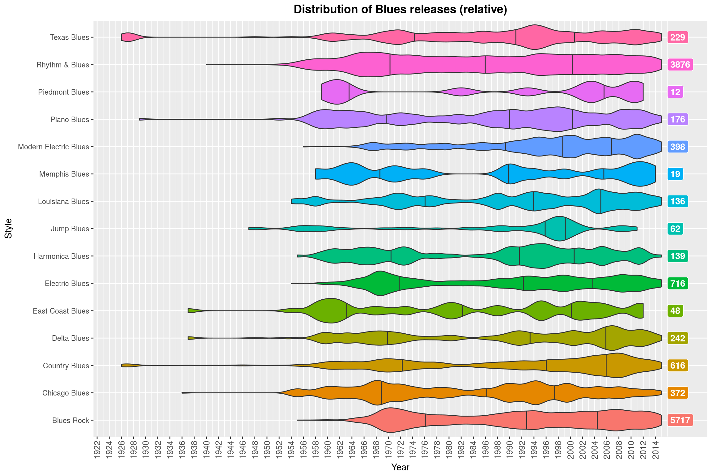
make_style_violin_plot_by_regex('Metal', FALSE) +
labs(title = 'Distribution of Metal releases by subgenre (relative)',
y = 'Year',
x = 'Metal subgenre',
fill = 'Metal subgenre')
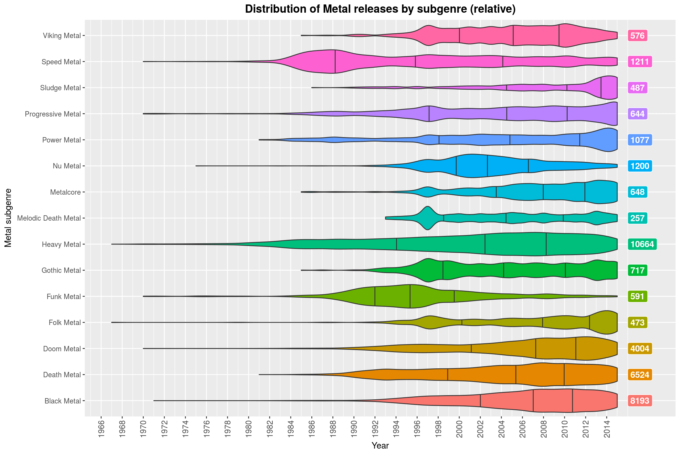
If you were sitting next to me right now, you’d hear me giggle because I like this plot so much. In case you are wondering: the colors do not actually convey any additional information, no, but I find the plot more pleasing to look at with some color. So, what do we see? For each genre, we see a violin plot (with marked quartiles) that shows the (relative) distribution, i.e., all of the violin plots have the same maximum height, regardless of the number of releases in that subgenre. The total number of releases for that genre is on the right, just for reference.
What this plot shows quite clearly is that certain subgenres went out of fashion (Funk Metal, Nu Metal, and Speed Metal) some time ago, while other genres are just peaking out (mostly more extreme subgenres like Black Metal and Doom Metal, but also more modern variants of Folk Metal and Progressive Metal). Then, of course, there is Metalcore, which is not really Metal by any sensible definition, sorry.
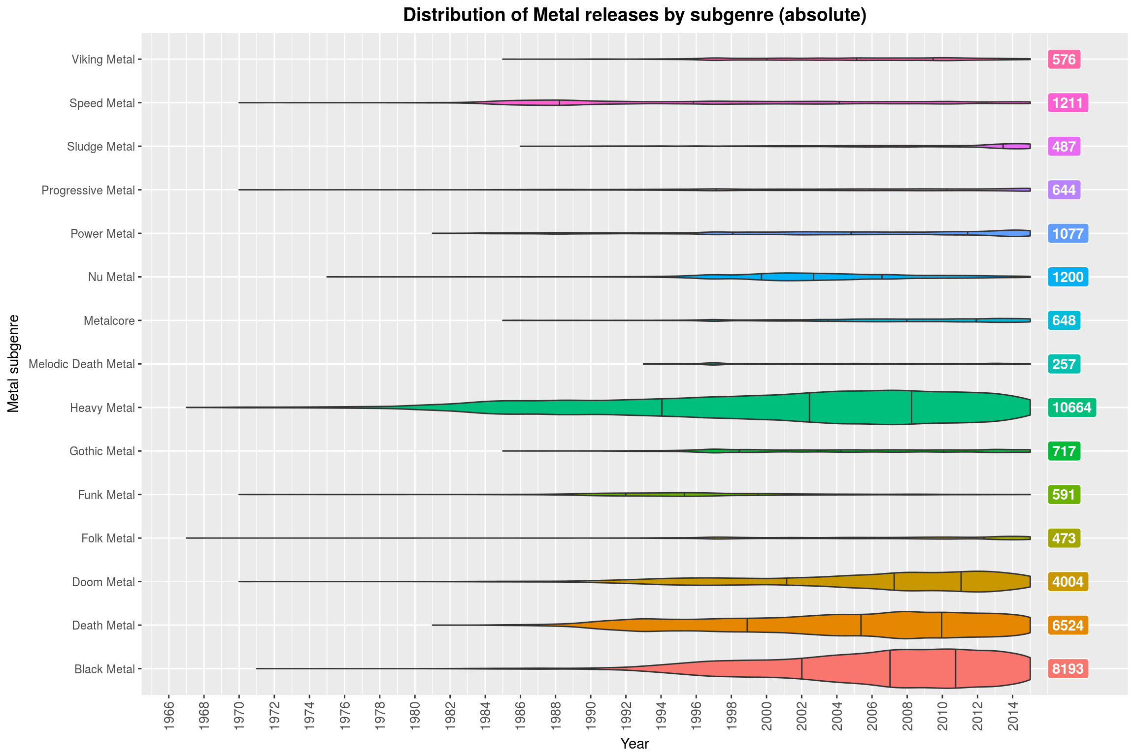
One could argue that the relative scaling makes this plot misleading. Indeed, without the scaling it becomes clear that most of these genres make up only a small fraction of all releases in the Metal genre. So the relative violin plots should really only be used to think about the development of the genre itself (which may be a great way to assess whether that genre is currently popular: if most of its releases are in the far past, it probably is not anymore).
make_style_violin_plot_by_regex('Metal', TRUE) +
labs(title = 'Distribution of Metal releases by subgenre (absolute)',
y = 'Year',
x = 'Metal subgenre',
fill = 'Metal subgenre')
Since that turned out to be so much fun, let’s try that again with some other sets of styles (always with relative scaling). A common way to beef up your genre is by prefixing it with Post, so here we go:
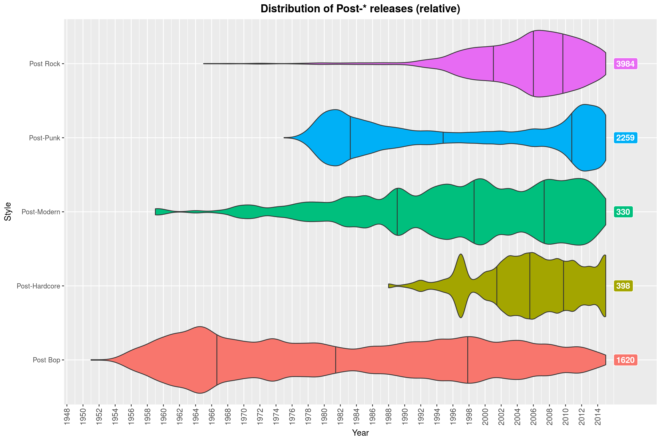
(Note how Contemporary Jazz is almost always a thing. Why might that be? ;) )
Song Lengths
And now for something completely different. I myself am a fan of long songs with unconvential structure, and not just Verse-Chorus-Verse-Chorus-Bridge-Chorus-Verse-Chorus etc. There are plenty of questions that one could tackle: Did the average length of songs change over the years? What about the number of songs on an album or the total album length? Are song lengths correlated with their position on the record? What is the genre with the longest or shortest songs?
We will start by collecting all song lenghts by year and put that in a long format:
song_length_by_year <- releases %>%
filter(!is.na(year)) %>%
group_by(year) %>%
do(.$tracks %>%
unlist %>%
as_data_frame %>%
filter(value != '\\N') %>%
transmute(length=as.numeric(value))) %>%
ungroup
Before we plot this data by year, we should inspect it in its entirety:
summary(song_length_by_year$length)
Min. 1st Qu. Median Mean 3rd Qu. Max.
0 173 227 253 290 17010000
This shows that there are a few peculiar data points in there. Note that the length is given in seconds, so neither 0 nor 259400 are values you’d expect to see. These outliers make up a minuscule part of the data set:
song_length_by_year %>%
filter(length > 3600) %>%
count %>% {
print(paste('Number of songs longer than one hour:', .[[1]]))
print(paste('Fraction of songs longer than one hour: ',
.[[1]] / nrow(song_length_by_year)))
}
[1] "Number of songs longer than one hour: 2060"
[1] "Fraction of songs longer than one hour: 0.000250719205078938"
song_length_by_year %<>% filter(length <= 3600)
ggplot(song_length_by_year, aes(x = length)) +
scale_y_continuous(trans = 'log10',
breaks = make_log_breaks(c(10, 20, 40), 6)) +
scale_x_continuous(breaks = seq(0, 3600, 120)) +
geom_histogram(binwidth = 30,
fill = 'white',
color = 'black') +
make_quantile_lines(song_length_by_year$length,
linetype = 'dashed',
alpha = .6,
size = 1) +
labs(title = 'Histogram of song lengths',
x = 'Length in seconds',
y = 'Number of songs (log. scaled)') +
year_theme
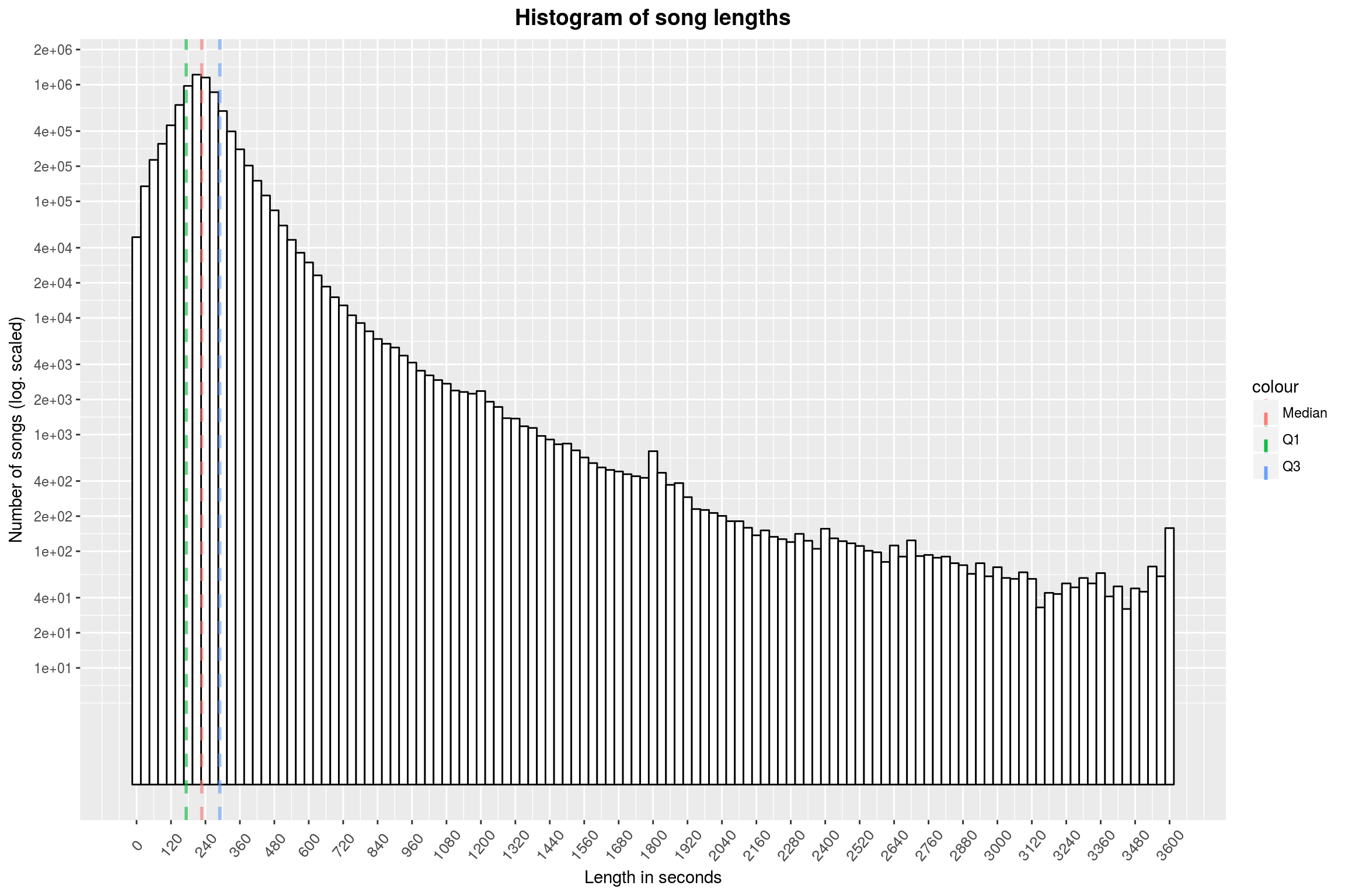
Unsurprisingly, the peak of the histogram is at about 3:30-4:00 (a common length for radio versions of songs). There are noticeable peaks at 20, 30 and 60 minutes. One might think that these are due to rounding, but I do not believe that, since the song lengths in the databases mostly come from the CD data themselves (and they are usually accurate to the second).
Next, there are two variants of the relationship between year of release and song length that one could investigate. First, one can ask for the distribution of song lengths by year (essentially getting a histogram such as this one above by year). Second, one can look at the distribution of years by song length (asking when most of the long songs were released for example). The second question seems more promosing at first, but since most of our releases are from the recent past, I expect that most releases for any length will be from the last few years. So let’s stick with the first question.
# split the data year-wise into bins of 15 seconds count the number of elements
# in each bin
song_length_by_year %>%
mutate(bin=as.integer(length / 15)) %>%
group_by(year, bin) %>%
summarise(bincount = n()) %>%
# Now normalize the bincounts per year
mutate(bincount = bincount / sum(bincount)) %>%
ungroup %>%
ggplot(aes(year, bin)) +
geom_raster(aes(fill = log10(bincount)),
interpolate=FALSE) +
year_theme +
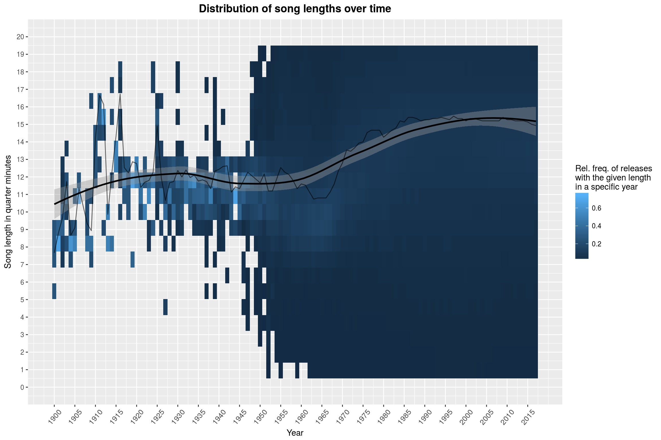
labs(title = 'Distribution of song lengths over time',
y = 'Song length in quarter minutes',
x = 'Year',
fill = 'Log. of rel. freq. of\nreleases with the given\nlength in a specific year') +
scale_y_continuous(breaks = seq(0, 240, 10),
limits = c(0, 240)) +
scale_x_continuous(breaks = seq(1900, 2017, 5)) +
# add some more goodies to the plot, like a line marking the average
# song length
{
song_length_by_year %>%
group_by(year) %>%
summarise(med = median(length)/15) %>%
geom_line(data = .,
aes(x = year, y = med),
color = 'black')
}
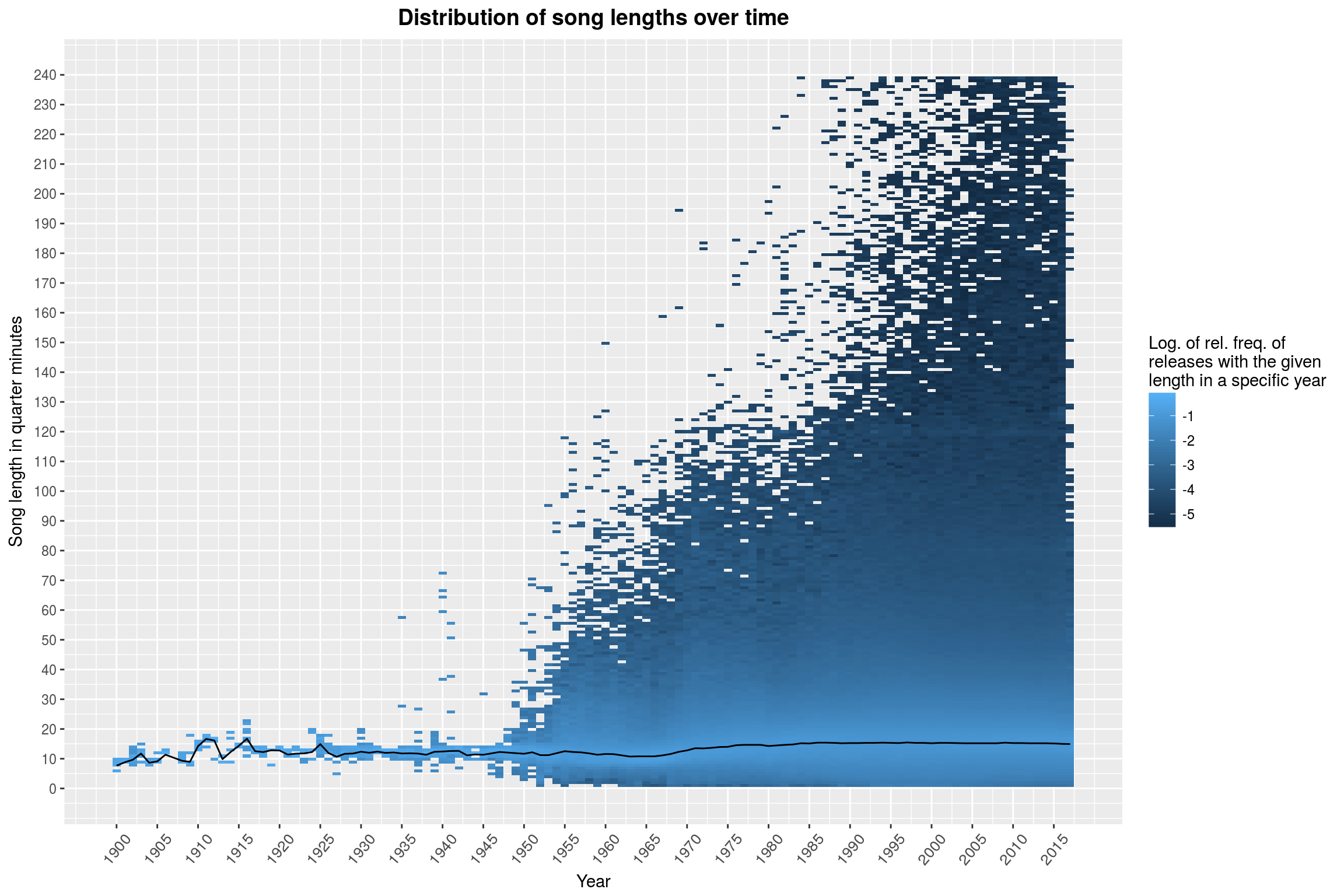
There you have it: Music never really freed itself from the 5-minutes-shackles installed by pre-LP vinyls. The distribution of song lengths does not seem to have changed all that much over the years. Sure, there are more extreme values, but the overall picture hasn’t changed. If you squint, you may see a slight drop from 1955 to 1965. The black line marks the median song length per year, and this seems to confirm this suspicion. Maybe it is worth taking a closer look at that, focusing on ‘short’ songs (less than 5 minutes, purely visually though) on a linear scale (instead of logarithmic):
song_length_by_year %>%
mutate(bin=as.integer(length / 15)) %>%
group_by(year, bin) %>%
summarise(bincount = n()) %>%
# Now normalize the bincounts per year
mutate(bincount = bincount / sum(bincount)) %>%
ungroup %>%
ggplot(aes(year, bin)) +
geom_raster(aes(fill = bincount),
interpolate=FALSE) +
year_theme +
labs(title = 'Distribution of song lengths over time',
y = 'Song length in quarter minutes',
x = 'Year',
fill = 'Rel. freq. of releases\nwith the given length\nin a specific year') +
scale_y_continuous(breaks = seq(0, 20, 1), limits = c(0, 20)) +
scale_x_continuous(breaks = seq(1900, 2017, 5)) +
{
song_length_by_year %>%
group_by(year) %>%
summarise(med = median(length) / 15) %>%
{
c(geom_smooth(data = .,
aes(x = year, y = med),
color = 'black'),
geom_line(data = .,
aes(x = year, y = med),
alpha = .6,
color = 'black'))
}
}
Aha! Now it really looks like something interesting happened to song lengths since the 1950s. Over the course of 50 years, the median song has become almost a minute longer! I did not expect to find this at all. If you take a look at the second-to-last plot, you will notice that recent years have seen releases with longer and longer songs. A first thought might be that this is what is causing the increase in observed song length – but this is just why we are using the median ;) Even when excluding anything beyond 10 minutes, the effect is still well visible:
song_length_by_year %>%
filter(length <= 600) %>%
group_by(year) %>%
summarise(med=median(length)/15) %>%
ggplot() +
year_theme +
labs(title = 'Median song length over time for songs of at most 10 minutes',
y = 'Song length in quarter minutes',
x = 'Year',
fill = 'Rel. freq. of releases\nwith the given length\nin a specific year') +
scale_y_continuous(breaks = seq(0, 20, 1),
limits = c(0, 20)) +
scale_x_continuous(breaks = seq(1900, 2017, 5)) +
{
c(geom_smooth(aes(x = year, y = med),
color = 'black'),
geom_line(aes(x = year, y = med),
alpha = .6,
color = 'black'))
}
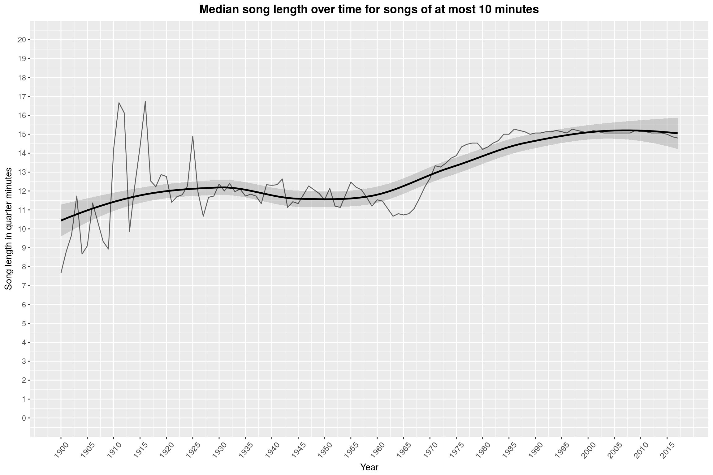
(Please mind that this is still not a rigorous statistical analysis of this apparent effect.)
Number of Tracks per Release
We could give the same treatment to the number of songs on an album, but we will keep that a bit shorter:
# find the lengths per year
num_tracks_by_year <- releases %>%
filter(!is.na(year)) %>%
group_by(year) %>%
do(.$tracks %>%
na.omit %>%
sapply(length) %>%
as_data_frame) %>%
ungroup %>%
set_names(c('year', 'length'))
There are, apparently, releases with 1450+ tracks:
summary(num_tracks_by_year$length)
Min. 1st Qu. Median Mean 3rd Qu. Max.
0.000 4.000 10.000 9.782 12.000 1454.000
But it seems fair to only consider releases with at most a hundred tracks, since the fraction of releases above that is rather insignificant:
num_tracks_by_year %>%
filter(length > 100) %>%
count / (num_tracks_by_year %>% count)
n
1 0.000655938
Finally, let’s take a look at a plot of the number of tracks on a release over time:
num_tracks_by_year %>%
group_by(year, length) %>%
summarise(bincount = n()) %>%
mutate(bincount = bincount / sum(bincount)) %>%
ungroup %>%
ggplot(aes(year, length)) +
geom_raster(aes(fill = bincount),
interpolate=FALSE) +
year_theme +
labs(title = 'Distribution of the number of tracks over time',
y = 'Number of tracks',
x = 'Year',
fill = 'Rel. freq. of releases\nwith the given track\ncount in a specific year') +
scale_y_continuous(breaks = seq(0, 100, 4),
limits = c(0, 100)) +
scale_x_continuous(breaks = seq(1900, 2017, 5)) +
scale_fill_gradient() +
{
num_tracks_by_year %>% group_by(year) %>% summarise(med=median(length)) %>%
{
c(geom_smooth(data = .,
aes(x = year, y = med),
color = 'yellow'),
geom_line(data = .,
aes(x = year, y = med),
alpha = .4,
color = 'yellow'))
}
}
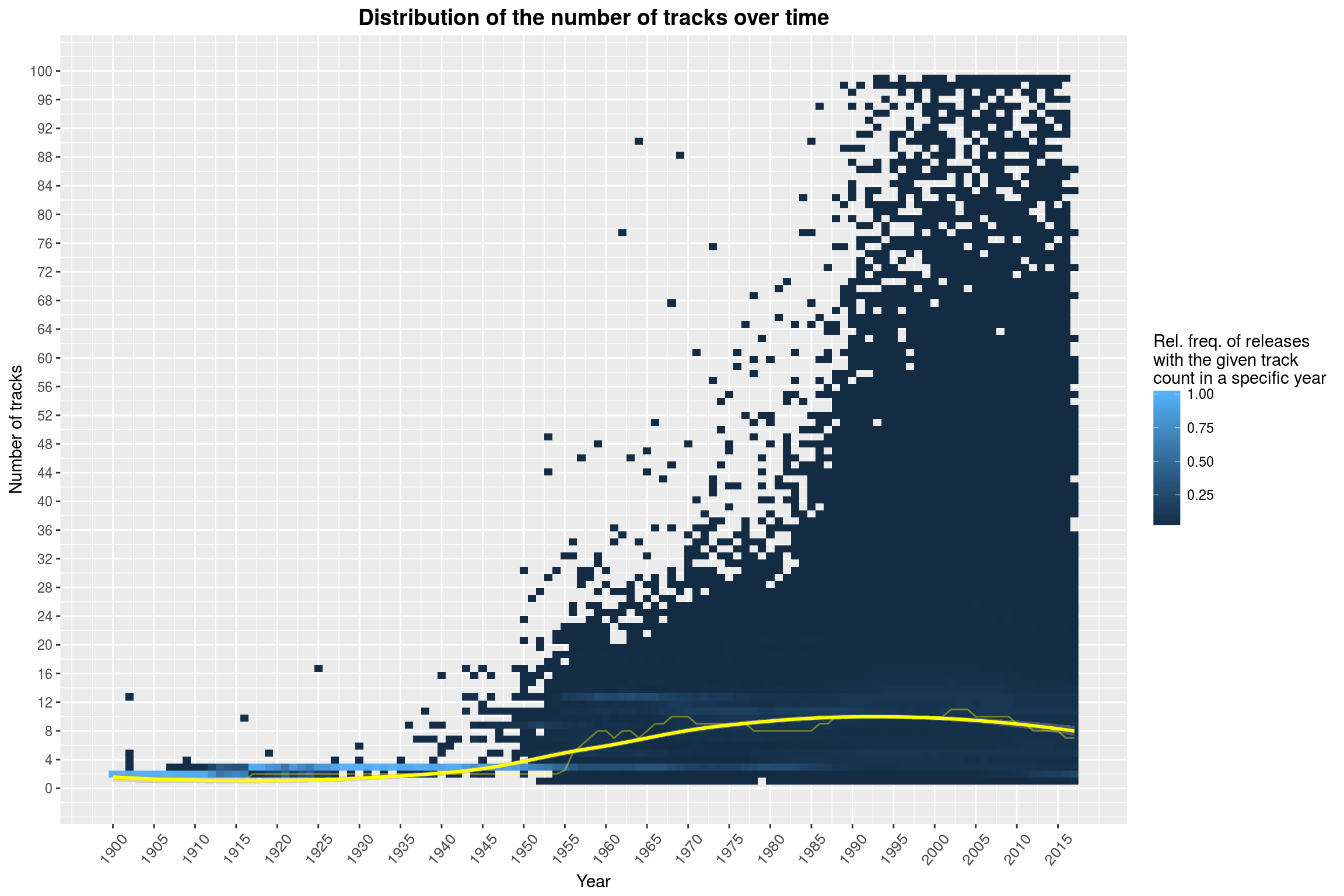
Clearly visible in the plot above is a jump in the number of tracks in about 1955 (this can be clearly seen by the yellow line marking the median by year). This may also be due to the fact that LPs became more prominent. The release of the CD in 1982 could be the reason for the second prominent feature of this plot, namely that there have been plenty of releases with absurd track counts from the 1980s on.
Track Position and Track Length
Something else that I am interested in is whether the position of a song on a release has an influence on the length of the piece. For this, we are going to transform each song to the relative position of the song, with the convention that we are always mapping to the middle of the interval that this song occupies (for example, on a release with two tracks, the first song would be mapped to the relative position 0.25 and the second to the position 0.75). You can see the results here, plotted as a point cloud:
releases %>%
sample_n(size = 5000) %>%
select(tracks) %>%
rowwise %>%
do(.$tracks %>%
{
data_frame(
len = .,
# compute relative position
rel_pos = (2*seq_along(.) - 1) / (2*length(.))
)
}
) %>%
na.omit %>%
ggplot(aes(x = rel_pos, y = len)) +
geom_jitter(alpha = .05,
width = .02) +
geom_smooth(method = 'gam') +
scale_y_continuous(limits = c(0, 1200)) +
scale_x_continuous(breaks = seq(0, 1, 0.05)) +
year_theme +
labs(title = 'Track lengths by relative position on release',
x = 'Relative position on release',
y = 'Track length in seconds')
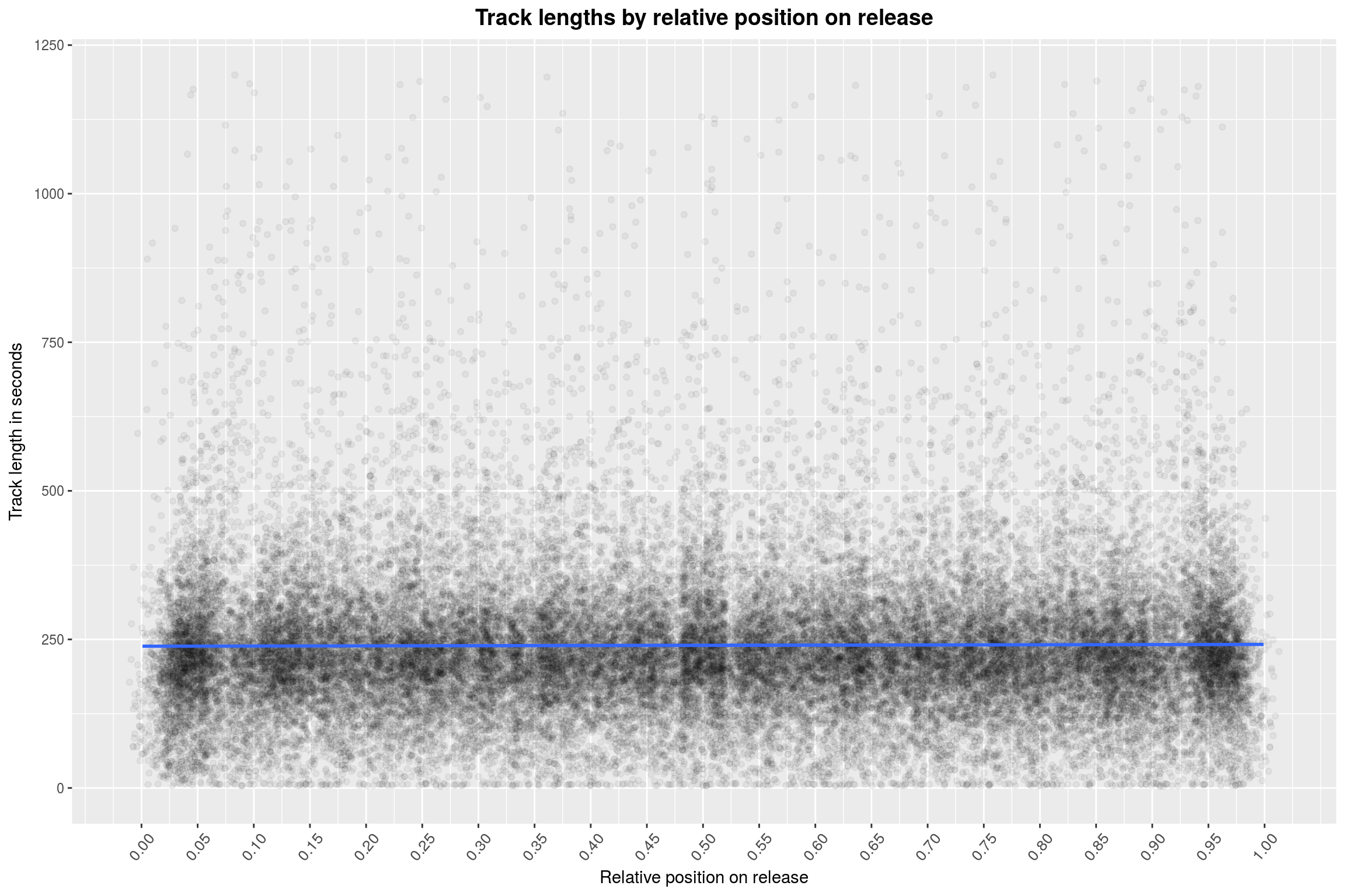
As you can see, I decided to only run this on a random sample of 5000 releases. Furthermore, there is no visible effect, except for slight declines at the ends (hard to see here) – but these are artifacts, due to the fact that the relative position of a song can never be 0 or 1 (and will, in fact, most likely be far from that, c.f. the statistics on tracks per release from above).
Also, when the relative position of a track is close to 0 or 1, then the release must have many tracks. Given that most releases come from formats with limit length, this means that the average length per song will be lower for these releases anyway. This is in fact a problem with this plot: It is not very useful for answering the question posed above. We are throwing all releases into one big bucket. It would be more helpful to normalize the track-lengths on each release (in a statistical sense) and then compare the z-scores at the relative positions to each other:
# population standard deviation
pop_sd <- . %>% {sqrt(var(.) * (length(.) - 1) / length(.))}
releases %>%
sample_n(size = 5000) %>%
select(tracks) %>%
rowwise %>%
do(.$tracks %>%
{
data_frame(
len = (. - mean(.)) / pop_sd(.),
rel_pos = (2*seq_along(.) - 1) / (2*length(.))
)
}
) %>%
na.omit %>%
ggplot(aes(x = rel_pos, y = len)) +
geom_jitter(alpha = .05,
width = .02) +
geom_smooth() +
scale_y_continuous(breaks = seq(-3, 3, 0.25),
limits = c(-3, 3)) +
scale_x_continuous(breaks = seq(0, 1, 0.05)) +
year_theme +
labs(title = 'Track lengths by relative position on release',
x = 'Relative position on release',
y = 'Track length in seconds (z-value)')
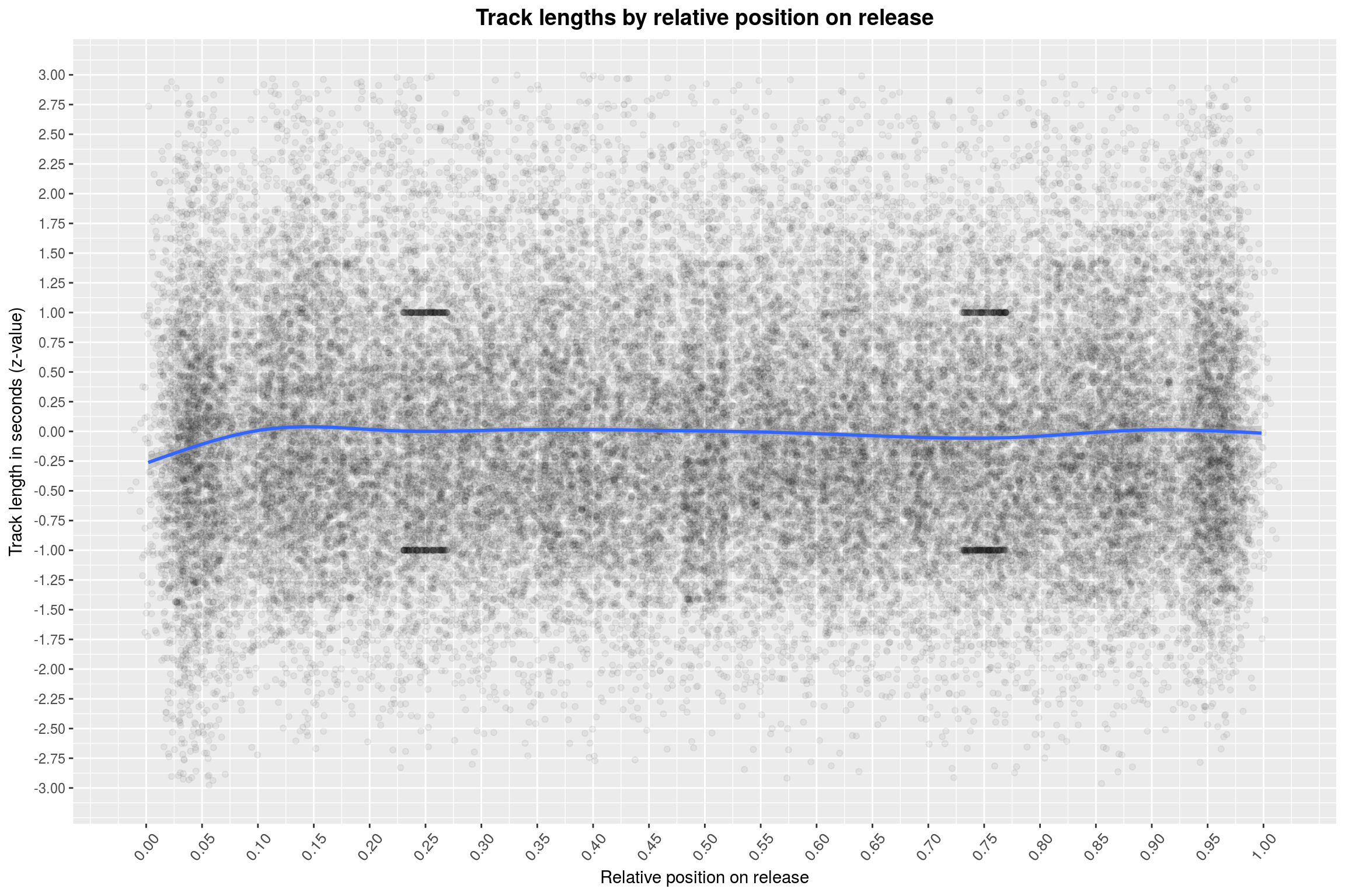
Hmh, the track lengths are still all over the place. You may see a few clusters of points in the plot; these are also artifacts of the way we display the data. For example, they occur prominently at 0.25 and 0.75 – which are just the positions you’d expect for a two-piece release. I’ll leave the rest of the calculation why they show up to you. One thing that I maybe dismissed as irrelevant a bit too early is the drop in track length at the beginning of an album. The effect is also clearly visible in this plot, also when just focusing on the points.
In general, I am not convinced that the idea of mapping a song to its relative position is all that useful. After all, this means that the first song could be anywhere between 0 and 0.5. The longer I think about it, the more naive this approach seems to me. Let’s ditch it.
Maybe it is a better idea to study the (z-transformed) song lengths for a fixed number of tracks and plot them as a violin plot (for a ten track release):
releases %>%
filter(sapply(tracks, length) == 10) %>%
select(tracks) %>%
rowwise %>%
do(.$tracks %>%
{
data_frame(
length = (. - mean(.)) / (pop_sd(.)),
pos = as.factor(seq_along(.))
)
}
) %>%
na.omit %>%
ggplot(aes(x = pos, y = length)) +
geom_violin() +
scale_y_continuous(breaks = seq(-3, 3, 0.25),
limits = c(-3, 3)) +
geom_smooth(aes(x = as.integer(pos), y = length)) +
year_theme +
labs(title = 'Track lengths by position on release (ten tracks)',
x = 'Position on release',
y = 'Track length in seconds (z-value)')
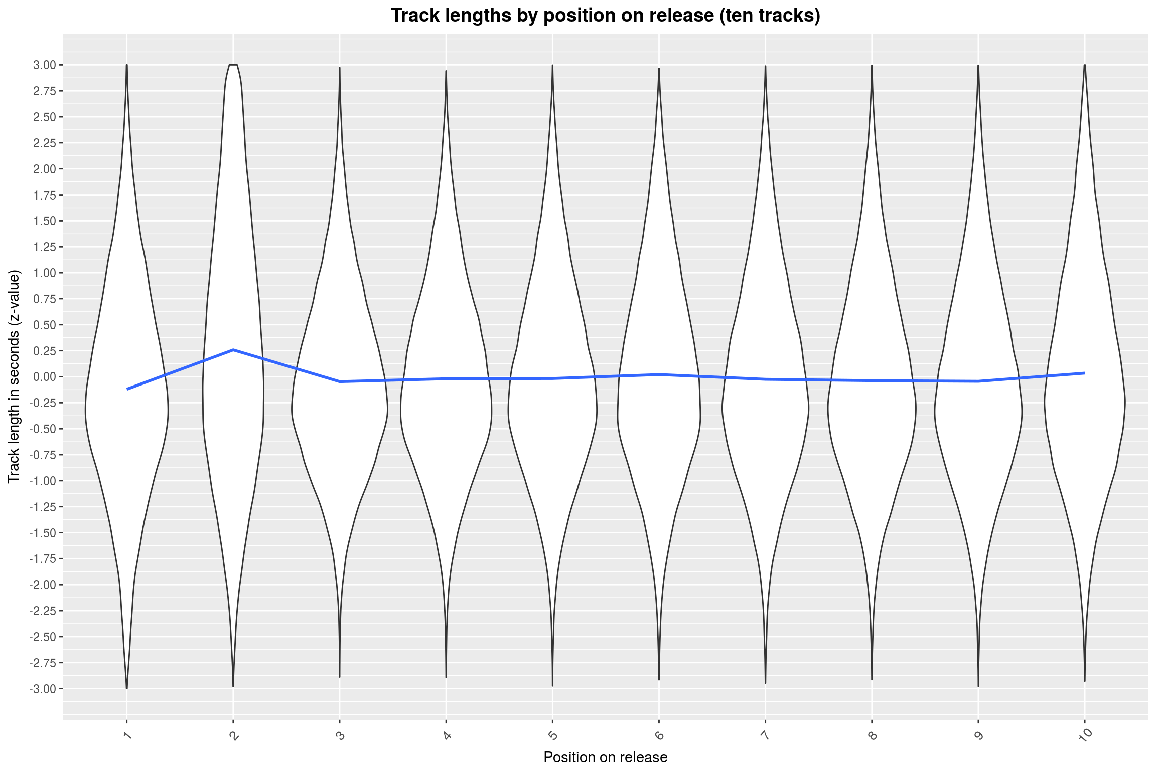
One of these things is not like the others, as they say. This is quite a surprise to me, to be honest. Why would the second song on a 10-track release be longer than the rest (on average)? I actually doubt the existence of this effect, it just seems so weird. Also, note how the z-values are all at most 3. This is actually true for arbitrary numbers of tracks: For \(n\) tracks, you get \(\sqrt{n−1}\) as an upper bound on the z-value. Thus we may just as well normalize by that.
So, can we find something similar for different number of tracks? Let’s take a quick look at lengths 5 to 20.
plot_track_lengths <- function(track_counts) {
releases %>%
filter(sapply(tracks, length) %in% track_counts) %>%
select(tracks) %>%
rowwise %>%
do(.$tracks %>%
{
data_frame(
# compute the normalized z-value
length = (. - mean(.)) / (pop_sd(.) * sqrt(length(.) - 1)),
pos = seq_along(.),
numtracks = length(.)
)
}
) %>%
na.omit %>%
ggplot(aes(x = pos,
y = length)) +
geom_violin(aes(x = as.factor(pos))) +
facet_grid(numtracks ~ .) +
year_theme +
labs(title = 'Track lengths by position on release',
x = 'Position on release',
y = 'Track length in seconds (normalized z-value)')
}
plot_track_lengths(5:8)
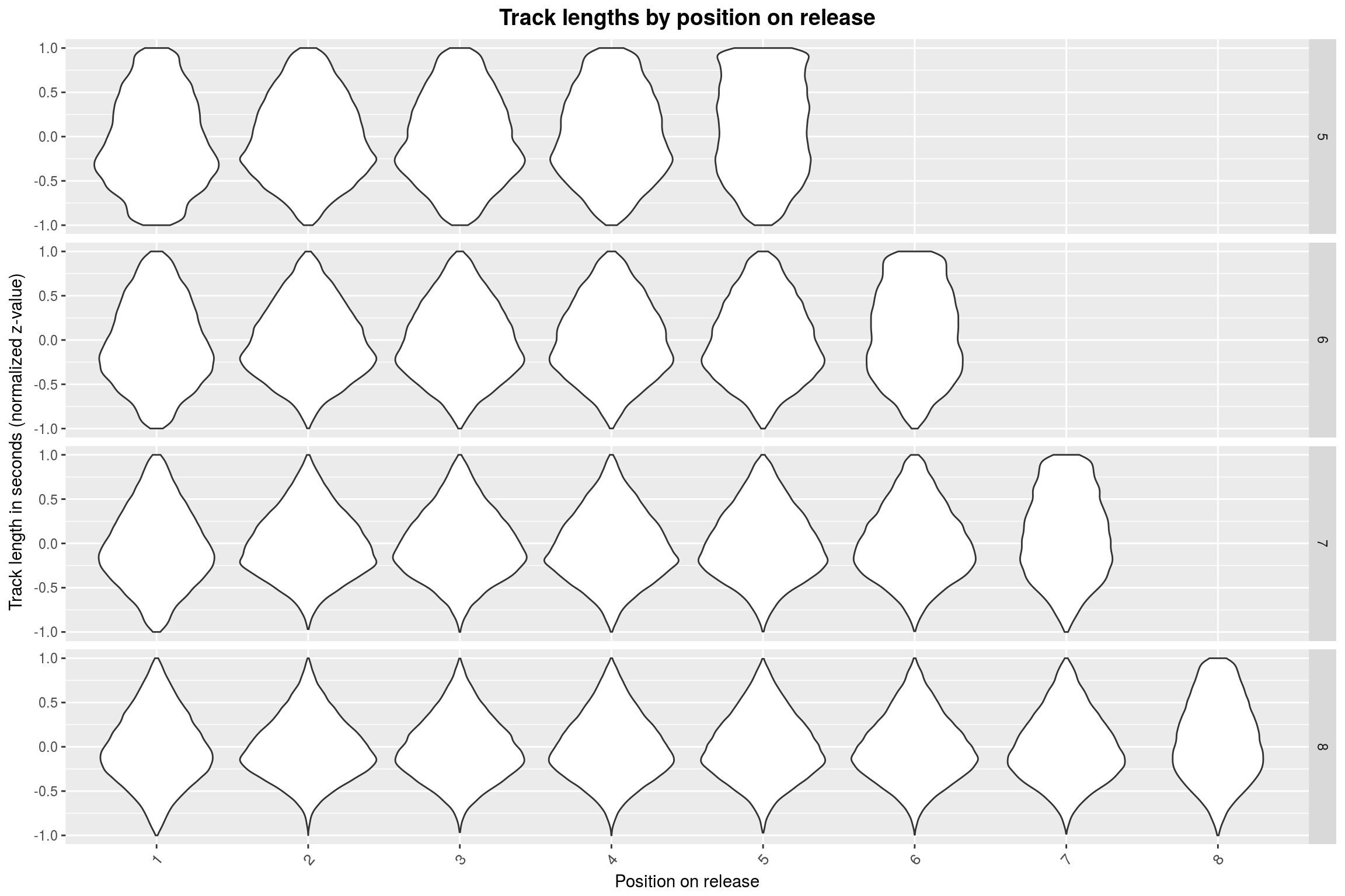
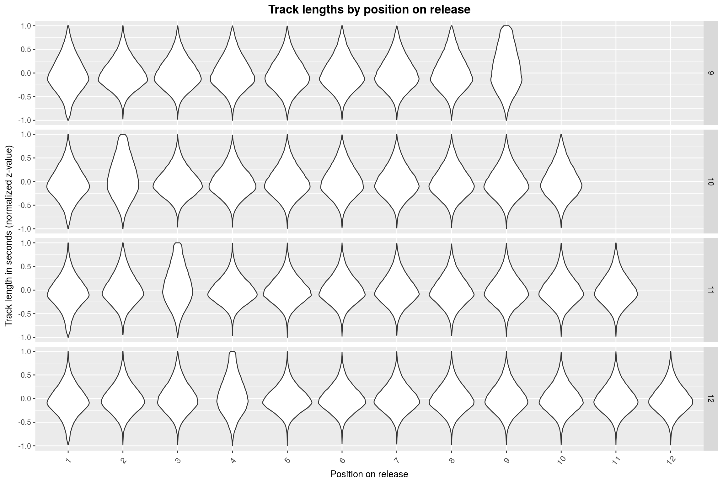
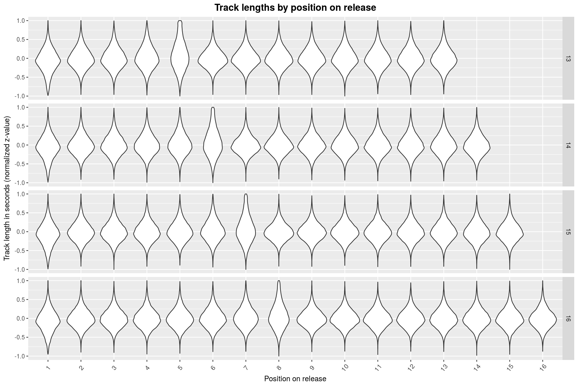
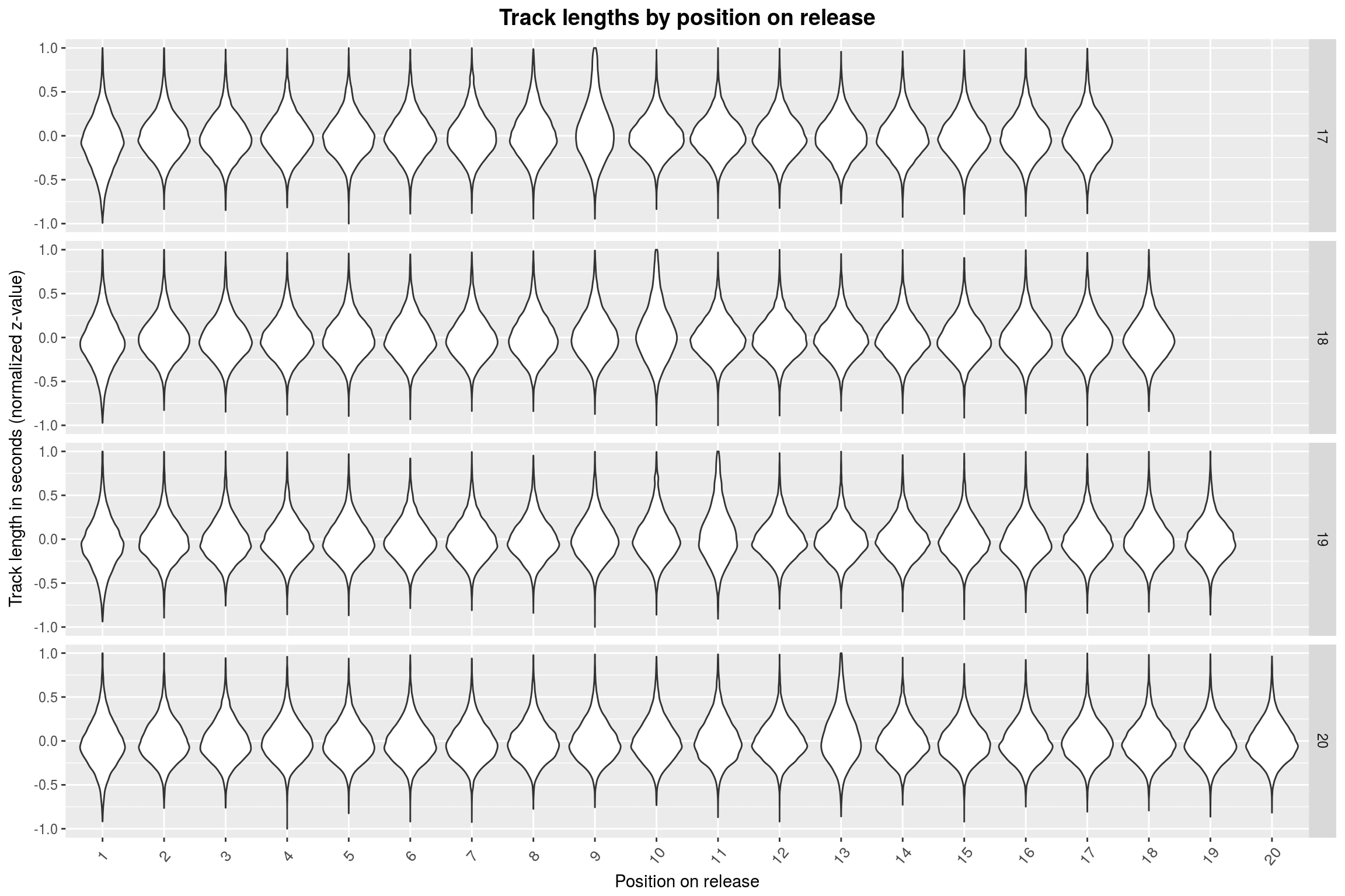
For 5 through 9 tracks, it seems that the last track is mostly the longest. This abruptly changes when going to 10+ track releases: Here, the longest track is mostly found somewhere at the start of the release. To make matters more absurd, this position is shifted by one whenever the number of tracks on the release is incremented. Furthermore, the more songs there are on the release, the less extreme is the effect.
I am still very sceptical of this ‘effect’. Surely there is something obvious that I missed. We can take a less sophisticated approach and simply look at the position of the longest track on a release, just as a sanity-check:
releases %>%
select(tracks) %>%
rowwise %>%
filter(!any(sapply(tracks, is.na)) & length(tracks) %in% 5:20) %>%
mutate(maxlen = which.max(tracks), numtracks = length(tracks)) %>%
ggplot(aes(x = numtracks, y = maxlen)) +
geom_count(aes(size = ..prop.., group = numtracks)) +
# yes, I know that technically it is discrete.
scale_x_continuous(breaks = seq(5, 20, 1)) +
scale_y_continuous(breaks = seq(1, 20,1)) +
year_theme +
labs(title = 'Distribution of the position of the longest track on a release',
x = 'Number of tracks',
y = 'Track position')
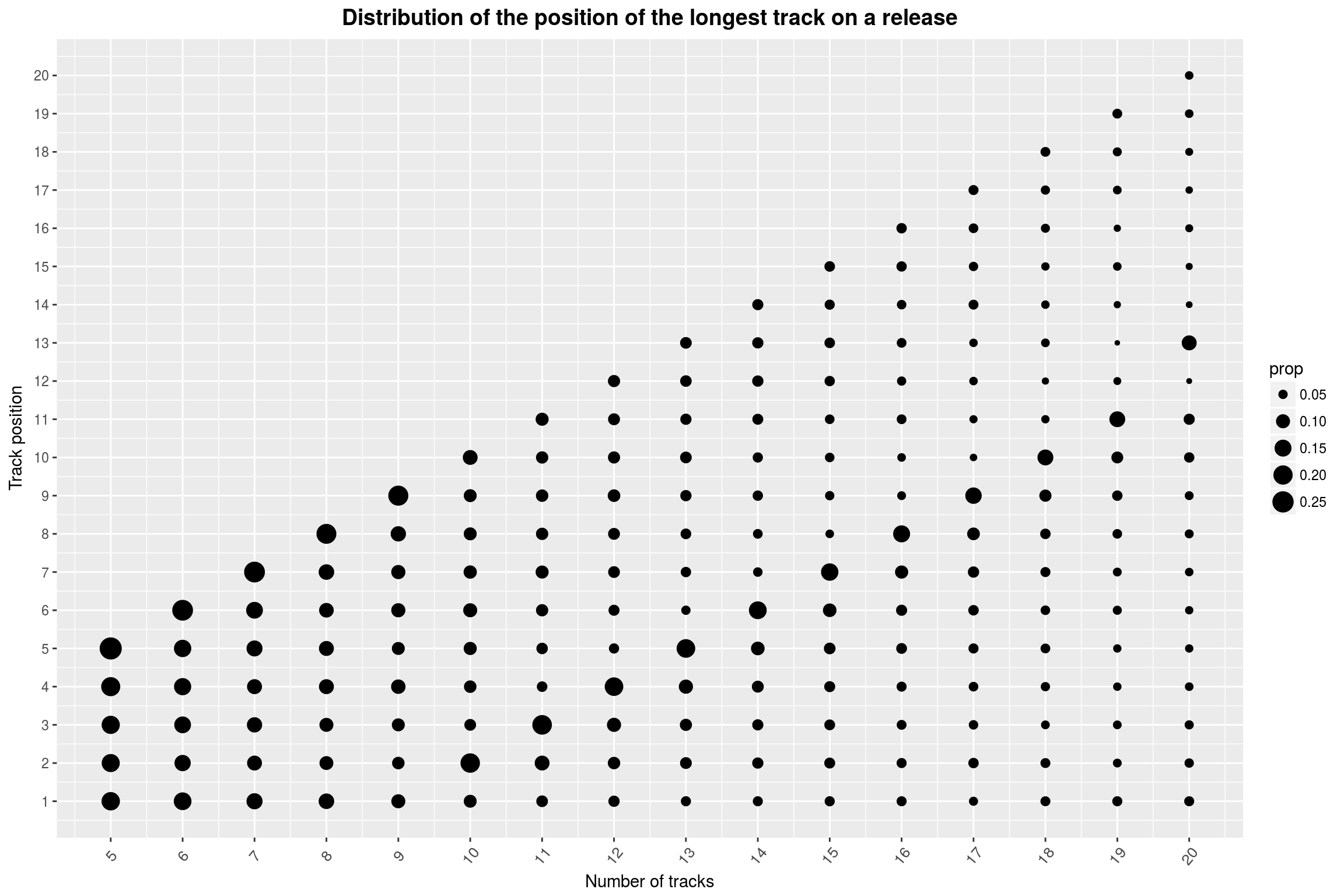
…but the effect remains. Maybe there is some deep reason as to why releases with 10 to 19 releases tend to have their longest track in the 8th-to-last position. (If you look closely, it seems very unlikely that the position immediately following that contains the longest song.) The jump from releases of length 9 to releases of length 10 is something I fail to come up with an explanation for.
Artists and Gender Distribution
Anything up until this point could have been done with a dataset coming from Discogs directly, without using any data gained by combining it with the MusicBrainz database. In retrospect, this would have simplified things greatly and even increased the number of releases for which genre information is available (since it is available for all Discogs entries). I did not expect to be able to get so much mileage out of the relese information alone.
Here are some more questions that we could investigate when including artist data: What is the distribution of number of releases per artist for each style? What is the average lifetime of a band? How many styles or genres are typically attributed to a single band?
Incorporating country and lifetime data (which is why I bothered with two databases to begin with!) we could also ask: For each country, what is the most prominent genre in that country? In which countries did the number of active musicians change the most over the last few years? For single artists, how much does the length of their life vary with the genres they are mostly associated with?
Alas, I will only have time to look at a selected few of these questions, since this project has already taken me much longer than I anticipated.
To get a better overview over the data, let us take a look at a few general statistics first:
Distribution of artists’ types: | Type | Count | | ————- |————-:| | group |161027 | | other |1842 | | person |101506 |
Distribution of artists’ gender: | Gender | Count | | ————- |————-:| | f |18097 | | m |56025 | | o |151 |
Note here that gender is of course only available for persons. I was first going to plot the age of death separated by gender, but I just came up with something much more interesting: From the table above, we can see that the ratio of men to women is about 3 to 1 in total. How did that change over the years? So for each year, I’d like to see how many male and female artists were active in that time year.
# Helper function to replace a NA value with a default value.
check_na <- function(x, default) ifelse(is.na(x), default, x)
active_artists_by_year_and_gender <- artists %>%
filter(type == 'person' & !is.na(gender) & !is.na(beginyear)) %>%
{
# group by year and gender and count the number of entries (births/deaths)
begin_cns <- group_by(., gender, beginyear) %>%
count %>%
ungroup
end_cns <- filter(., !is.na(endyear)) %>%
group_by(gender, endyear) %>%
count %>%
ungroup
# then join (by year and gender), take the difference between births and
# deaths, and compute cummulative sums
full_join(begin_cns,
end_cns,
by = c("beginyear"="endyear", "gender"="gender")) %>%
transmute(year = beginyear,
gender,
begin = check_na(n.x, 0), end = check_na(n.y, 0)) %>%
transmute(year,
gender,
n = begin-end) %>%
group_by(gender) %>%
arrange(year) %>%
mutate(cn = cumsum(n)) %>%
select(-n) %>%
ungroup
} %>%
# now also compute the total number of artists per year to make a
# relative display
group_by(year) %>%
mutate(total=sum(cn))
active_artists_by_year_and_gender %>%
ggplot() +
geom_area(stat = 'identity',
aes(x = year, y = cn / total, fill = gender),
color = 'black') +
scale_x_continuous(breaks = seq(1900, 2017, 5),
limits = c(1900, 2017)) +
scale_y_continuous(breaks = seq(0, 1, 0.05)) +
year_theme +
labs(title = 'Relative proportions of alive artists by year and gender',
x = 'Year',
y = 'Proportion',
fill = 'Gender')
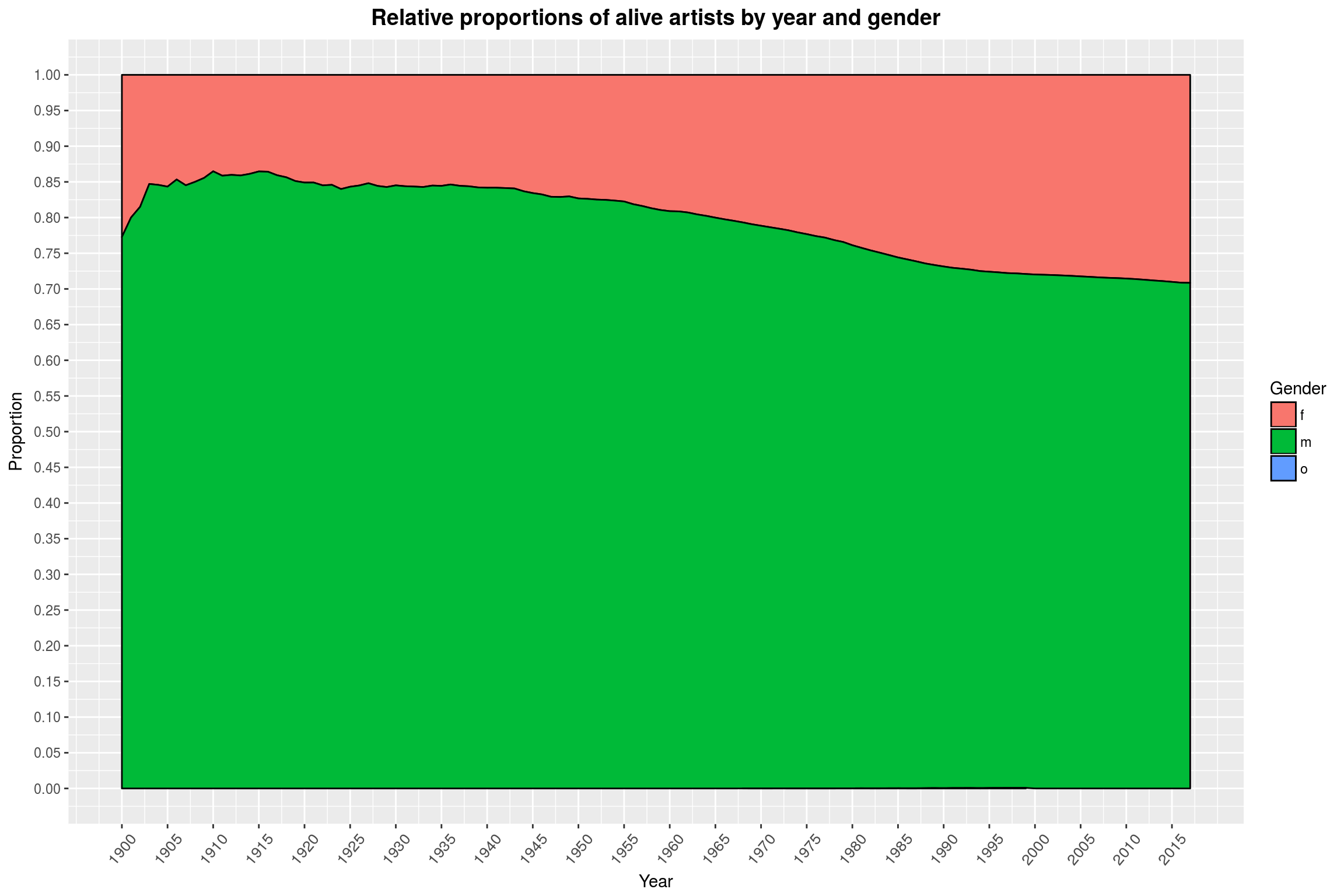
We have to be very careful with what this plot is actually showing: We count the number of births in a year minus the number of deaths in a year, then take a cummulative sum of that. First, someone who is born in 1900 is probably not making music until 20 years later. Also, we do not have birth data for artists before 1900, but I’d assume that most of them were men. Therefore, the graph should probably be read with a 20 year offset and a smaller number of women in the first years. Finally, it should be noted that we simply do not have any birth data for artists who identify as neither male nor female available (represented by the non-existent blue area).
This however would only amplify the qualitative effect that is visible: Namely that the number of women among musicians has increased over the last 100 year, with a ratio of about 3:1 of men to women in recent years. This is also the value we observed for the full data set. This is essentially because of what you can see in this next graph here, which shows the number of artists (excluding bands) that are active by year.
active_artists_by_year_and_gender %>%
ggplot() +
geom_line(aes(x = year, y = total)) +
year_theme +
scale_y_continuous(breaks = seq(0, 40000, 2500)) +
scale_x_continuous(breaks = seq(1900, 2017, 5)) +
labs(title = 'Number of active artists by year',
x = 'Year',
y = 'Number of active artists')
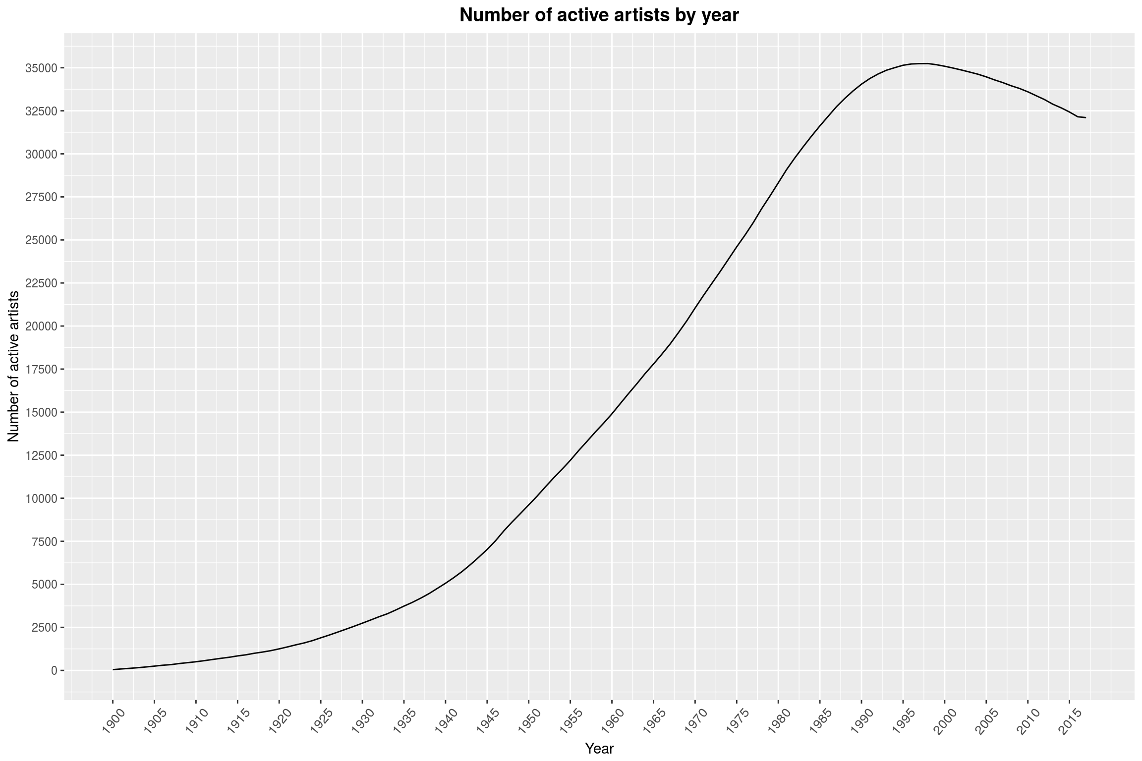
The number of active artists that we have data on now is simply much, much greater than in, say, the 1950s. The dip in active artists over the last few years is a bit of a surprise to me. There surely is a clever explanation for that; especially since the total number of active artists (including bands) has never been as high as today:
active_artists_by_year <- artists %>%
filter(!is.na(beginyear)) %>%
{
# group by year and gender and count the number of entries (births/deaths)
begin_cns <- group_by(., beginyear) %>%
count %>%
ungroup
end_cns <- filter(., !is.na(endyear)) %>%
group_by(endyear) %>%
count %>%
ungroup
# then join (by year), take the difference between births and deaths,
# and compute cummulative sums
full_join(begin_cns,
end_cns,
by = c("beginyear"="endyear")) %>%
transmute(year = beginyear,
begin = check_na(n.x, 0),
end = check_na(n.y, 0)) %>%
transmute(year,
n = begin-end) %>%
arrange(year) %>%
mutate(cn = cumsum(n)) %>%
select(-n) %>%
ungroup
}
active_artists_by_year %>%
ggplot() +
geom_line(aes(x = year, y = cn, color = 'Total')) +
geom_line(data = active_artists_by_year_and_gender,
aes(x = year, y = total, color = 'Persons')) +
year_theme +
scale_x_continuous(breaks = seq(1900, 2017, 5)) +
scale_y_continuous(breaks = seq(0, 100000, 5000)) +
labs(title = 'Number of active artists by year',
x = 'Year',
y = 'Number of active artists',
color = 'Types')
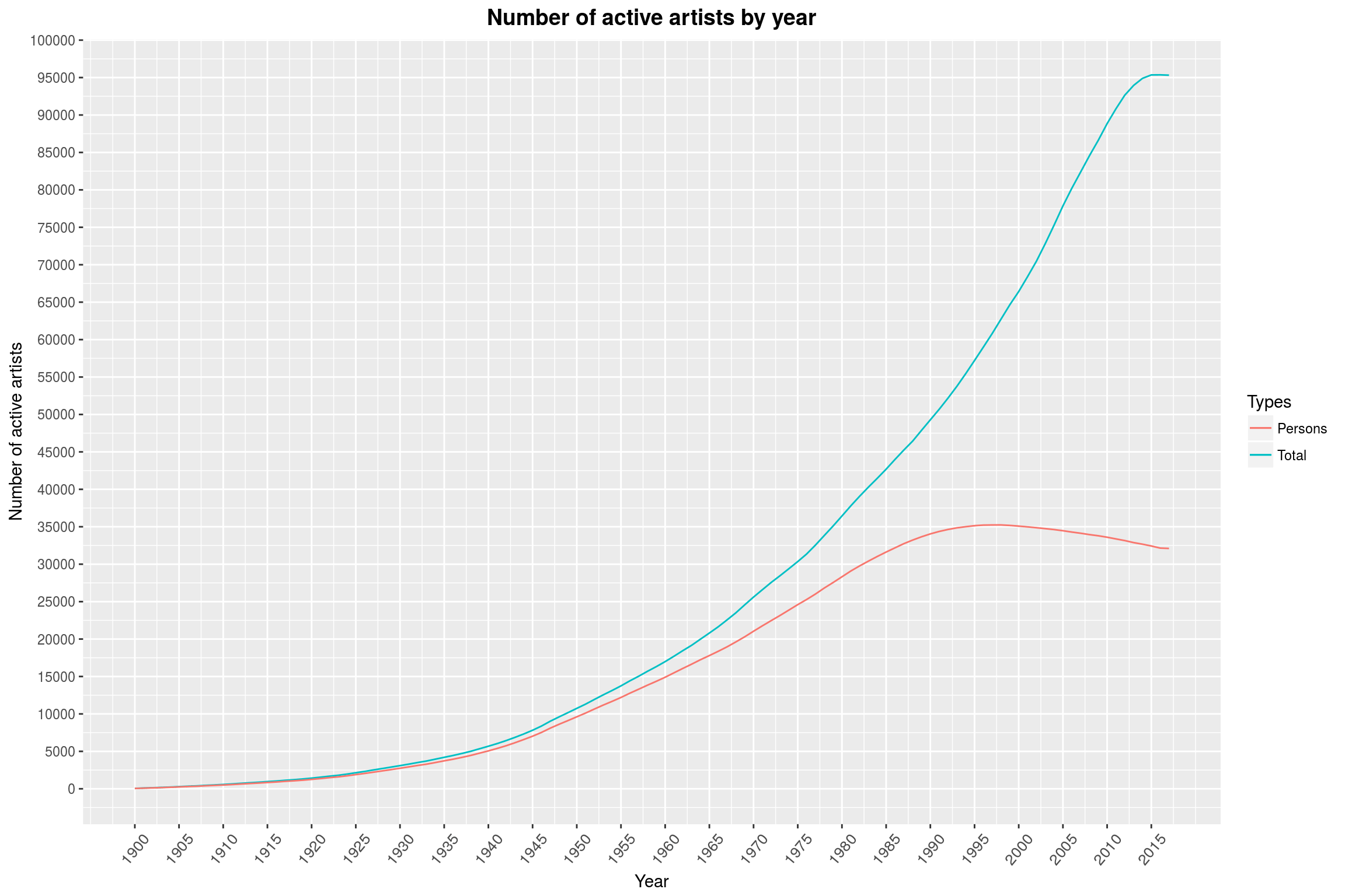
Maybe people are just more likely to make (and release) music together than alone?
Band Lifetimes
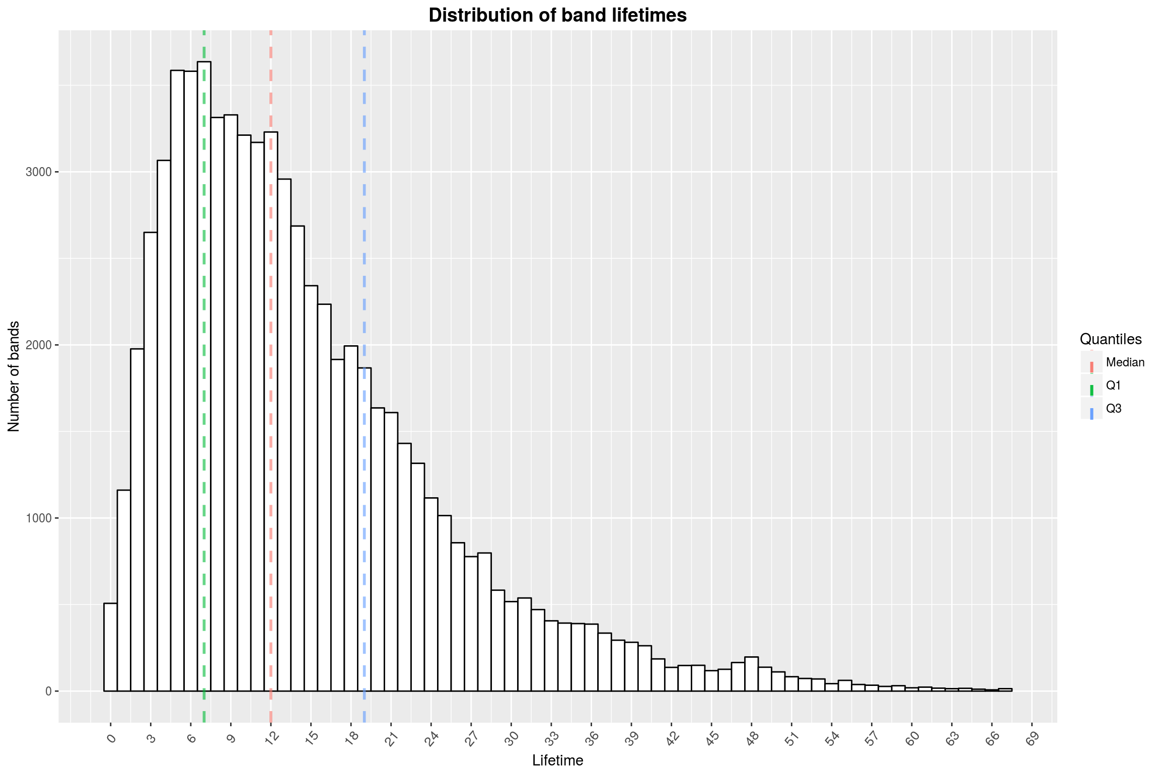
While we are discussing periods in which artists are active, I’d like to take a look at the distribution of the lifetimes of bands specifically. I am mostly interested in modern music, and if you look at all bands at once you will also find some ancient brass bands. Therefore, we will limit the investigation to groups that were formed from 1950 on.
artists_lifetimes <- artists %>%
filter(beginyear >= 1950 & type == 'group' & (!ended | !is.na(endyear))) %>%
mutate(endyear = check_na(endyear, 2017)) %>%
filter(!is.na(endyear)) %>%
mutate(duration = endyear - beginyear)
artists_lifetimes %>%
ggplot(aes(x = duration)) +
geom_histogram(binwidth = 1,
color = 'black',
fill = 'white') +
make_quantile_lines(artists_lifetimes$duration,
linetype = 'dashed',
size = 1,
alpha = .6) +
scale_x_continuous(breaks = seq(0, 120, 3)) +
year_theme +
labs(x = 'Lifetime',
y = 'Number of bands',
title = 'Distribution of band lifetimes',
color = 'Quantiles')
Now we can similarly look at the average number of years between releases (for bands founded after 1950 with at least 2 releases).
artists_lifetime_vs_releases <- artists %>%
filter(beginyear >= 1950 & type == 'group') %>%
mutate(endyear = check_na(endyear, 2017)) %>%
mutate(duration = endyear - beginyear,
num_releases = sapply(.$releases, length)) %>%
filter(num_releases > 1)
artists_lifetime_vs_releases %>%
ggplot(aes(x = duration / num_releases)) +
geom_histogram(binwidth = 0.5,
color = 'black',
fill = 'white') +
make_quantile_lines(
artists_lifetime_vs_releases$duration / artists_lifetime_vs_releases$num_releases,
linetype = 'dashed', size = 1, alpha = .6) +
scale_x_continuous(breaks = seq(0, 35, 1)) +
year_theme +
labs(title = 'Distribution of years between releases for bands',
x = 'Avg. years between releases',
y = 'Number of bands',
color = 'Quantiles')
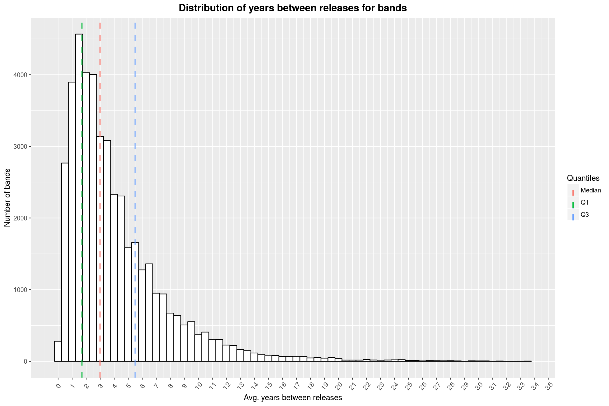
From this plot, I can only conclude that you (and I) should stop complaining that your favorite band hasn’t released asn album for almost 2 years now.
Artists by Countries
Now we are going to address the elephant in the room, namely making a map showing the number of artists per country. As a first step, take a look at this histogram so we have a better idea of what to expect.
artists_per_country <- artists %>%
filter(!is.na(country)) %>%
group_by(country) %>%
count
artists_per_country %>%
arrange(desc(n)) %>%
slice(1:30) %>%
ggplot(aes(x = reorder(country, -n), y = n)) +
geom_bar(stat = 'identity',
color = 'black',
fill = 'white') +
year_theme +
labs(title = 'Artists by country (top 30)',
y = 'Number of artists',
x = 'Country') +
scale_y_continuous(breaks=seq(0, 50000, 2500))
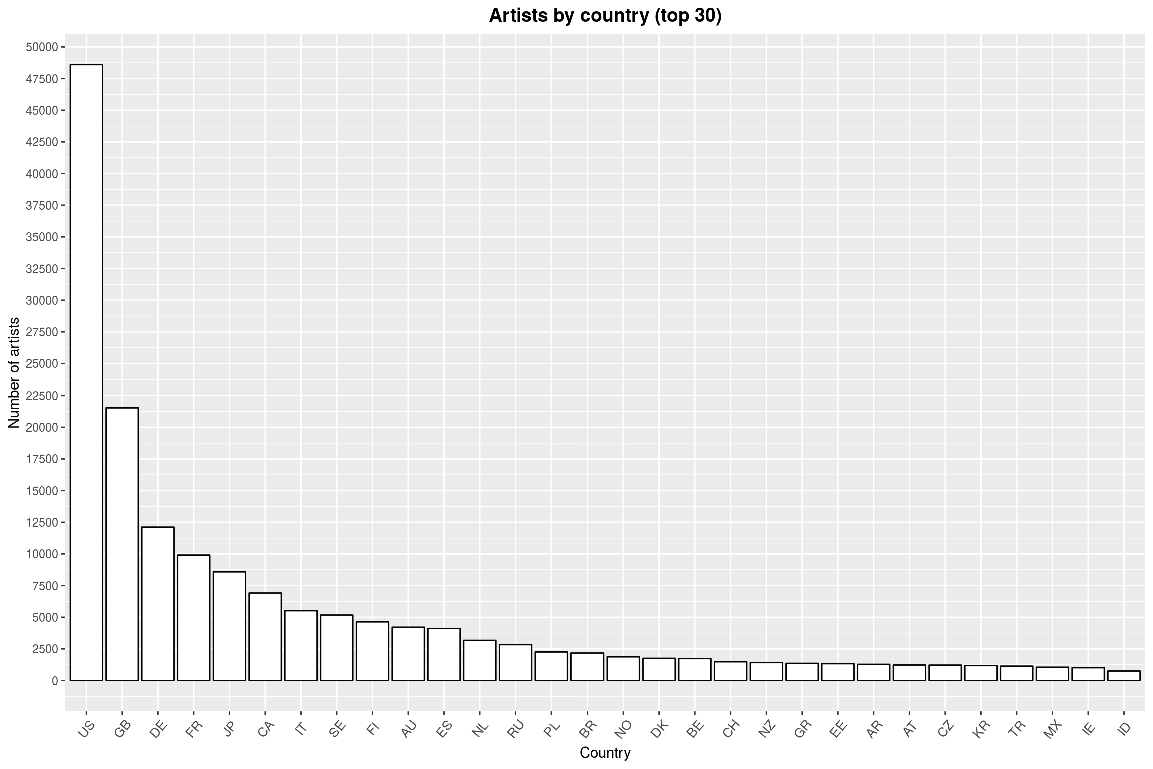
The data (unsurprisingly) contains primarily US artists, followed by other developed countries. So if a map is to be of any help, it should allow the enduser to read off the data for smaller countries.
# join with a list of all country codes to ensure that we have data for each country
artists_per_country %<>%
full_join(iso3166 %>% select(a2, a3, sovereignty),
by = c('country'='a2')) %>%
mutate(n = check_na(n, 0))
There are now multiple ways to make a such a map. The ggplot2 way is probably like this:
world_map <- map_data('world') %>%
mutate(region = iso.alpha(region, 2))
ggplot() +
geom_map(data = artists_per_country,
map = world_map,
aes(map_id = country, fill = log10(n+1)),
color = "white",
size = 0.25) +
expand_limits(x = world_map$long,
y = world_map$lat)
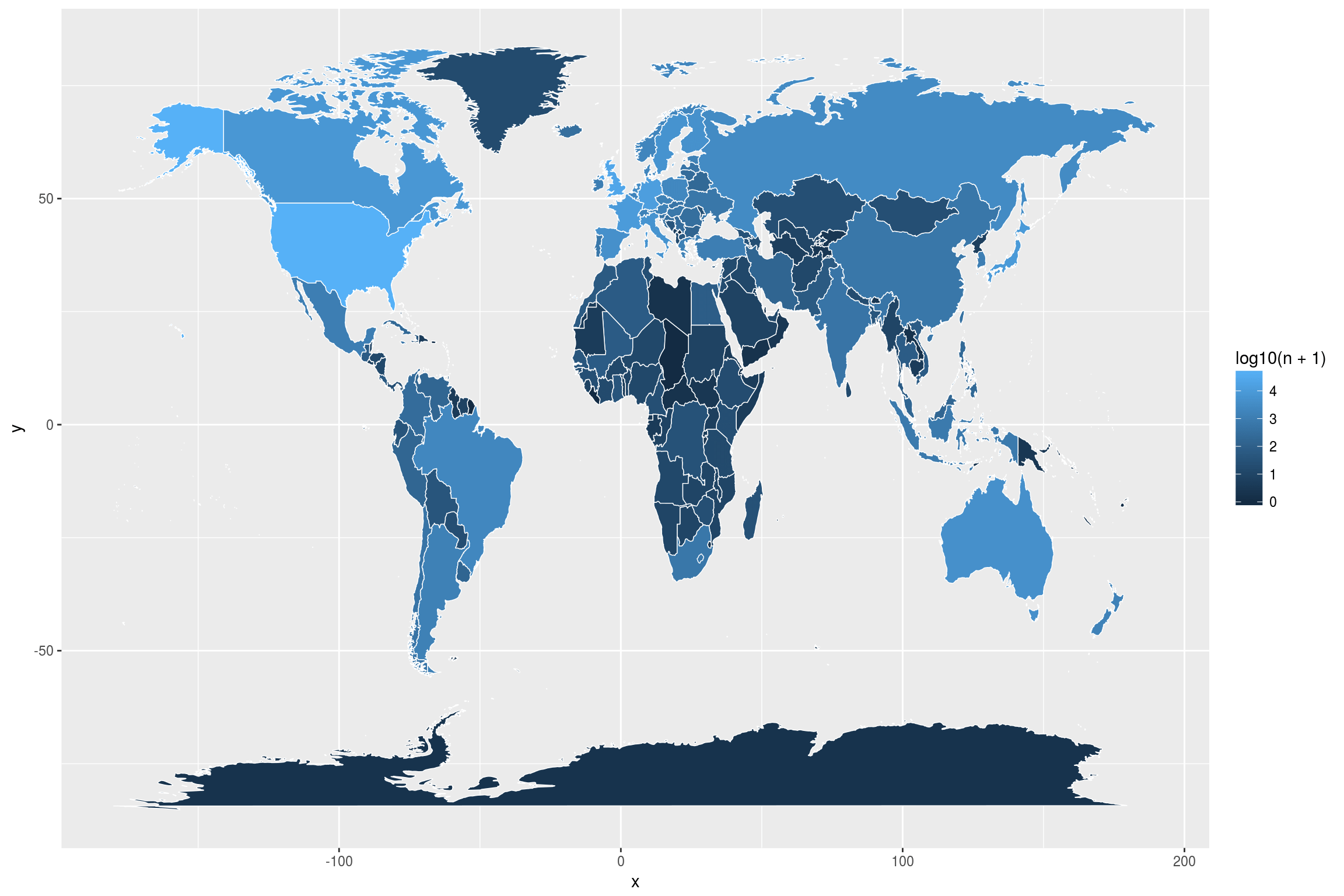
On the one hand, this map is pleasant to look at and easy to render. We do not need to join the data we want to visualize with the world map itself. But I feel that this map is suboptimal: There are many small regions that are hard to see and it is almost impossible to use this map to make any but the broadest statements. For example, can you tell from the map whether there are no artists in, say, Chad? (There are none.) Does China or India have more artists in the database? (China.) What about Luxembourg, can you even see that? (No, you cannot.) This is, I think, where interactivity really makes sense. Here is a way to do this, combining ggplot2 and plotly:
ggplotly(
world_map %>%
full_join(artists_per_country,
by = c('region' = 'country')) %>%
ggplot(aes(x = long, y = lat, group = group, text = paste(region, ':', n))) +
geom_polygon(aes(fill = log10(n))) +
geom_path(color = 'white',
size = 0.1) +
theme_bw() +
labs(title = 'Number of artists per country')
)