- The Dataset
- Release Formats over Time
- Releases by Genre over Time
- Common Musical Styles
- Style Lifetimes
- Track Lengths by Position
- Conclusion
In spring last year, I somehow came to the conclusion that I needed to learn more about data science and machine learning. As part of that endeavour, I enrolled in two nanodegrees at Udacity, namely Data Science and Deep Learning. Project work is one of the pillars that these degrees are built around and I almost always enjoyed these projects greatly.
One of the projects for the Data Science nanodegree is called Exploratory Data Analysis and asks you to either pick one of their datasets apart or make one of your own and see what gems are hidden in there. As the name implies, this is not about statistical testing but about finding phenomena that one may want to take a closer look at.
Needless to say, I went with the second option. This blog post is a collection of my personal highlights from that project. You can read my full submission here, but it is quite long and uses an awkward tone for a blogpost, because that’s not what it was written for. It also includes some less-than optimal plots that illustrate the process of coming up with the right plot for a particular phenomenon.
I tried to restrict myself to a few plots from my submission, but there are many more there and it may be worth to go there and just scroll over it, stopping for the plots you find most interesting.
The Dataset
So, what dataset did I go for? You know, I am a big fan of all kinds of music, especially weird music, so it made sense to look for a music-related dataset. Unfortunately, I didn’t find a public dataset that tickled my fancy. So I went ahead and assembled one myself: I acquired a dump of the MusicBrainz’ database and the Discogs’ database, both available under very permissive licenses. Then I worked some Python magic to join both databases together and get a meaningful result. Specifically, I have data on artists (with their genders, active years, countries, and releases etc.) and on releases (with their formats, track lengths, release date, genre, and style information etc.)1. What I don’t have are meaningful ratings for either releases or artists. While MusicBrainz provides these, there are usually not enough of them to draw any meaningful conclusions.
In numbers:
- 317,578 artists,
- 1,032,619 releases,
- data since 1900 (in theory).
Beware of Biases in the Data
I am going to be upfront. Take everything below with a good pinch of salt, because there are certain biases in the dataset that you should be aware of:
- there is very little data from before 1950, which is why I am mostly ignoring it,
- the data is very much biased towards recent releases from the Western world, since both source databases come from primarily English websites and it is of course more likely that we have proper data from recent releases,
- very recent releases may not have been entered into the database yet and whether some obscure digital release has been entered is probably only down to luck, which is why I am mostly focusing on data up to the year 2015,
- I am ignoring all non-album releases.
To give you an idea of how bad some of the biases are, take a look at this plot here:
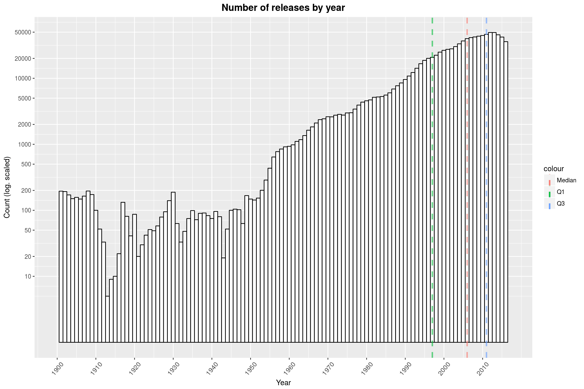 Note that the y-axis is log-scaled.
The data is only representative of itself, i.e. what releases and bands can be found in both databases, and reality may of course be somewhat different.
With that said, enjoy my plots from below.
Release Formats over Time
To get started, lets look at releases exclusive to specific formats (CD, Vinyl, digital etc.) over time and see the story of the death of the Vinyl:
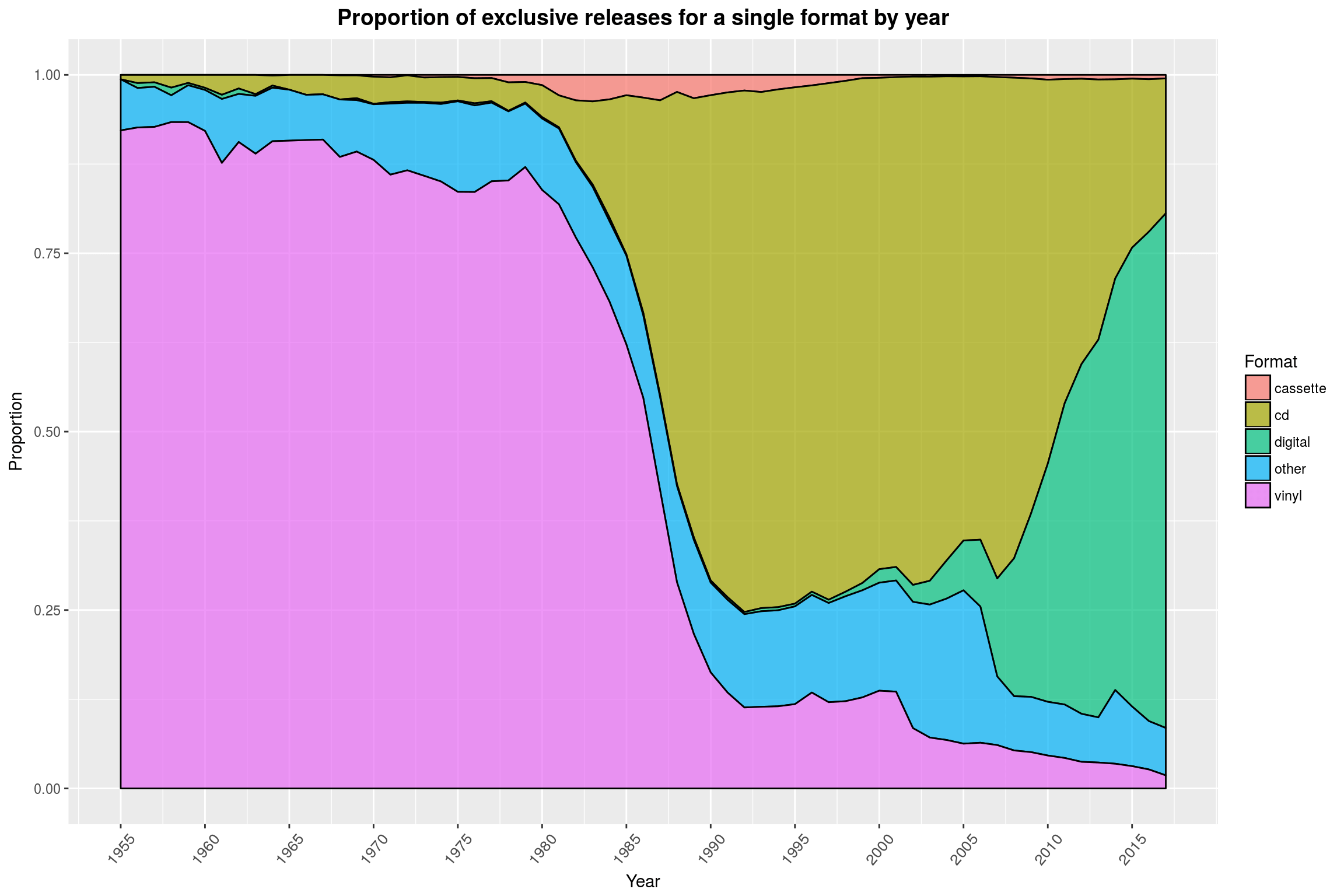 We are looking at what fraction of albums released in a year eventually saw a release on a given format, and only on that format. The story is very similar without the exclusivity. It is well visible that almost all releases between 1950 and 1980 eventually saw a vinyl release and that it took only 10 years for the CD to claim the throne after that – only to be apparently killed off by digital releases 25 years later.
If you were to look at the absolute number of releases per format, you would see that CDs and digital releases overtook their forebearers because there was just more and more music coming out in general, not because fewer albums were released on Vinyl.
For the record (no pun intended), I am not entirely sure what the other category is made of, because both Discogs and MusicBrainz offer a large selection of other kinds of formats that I didn’t count as vinyl, cassette or CD.
Releases by Genre over Time
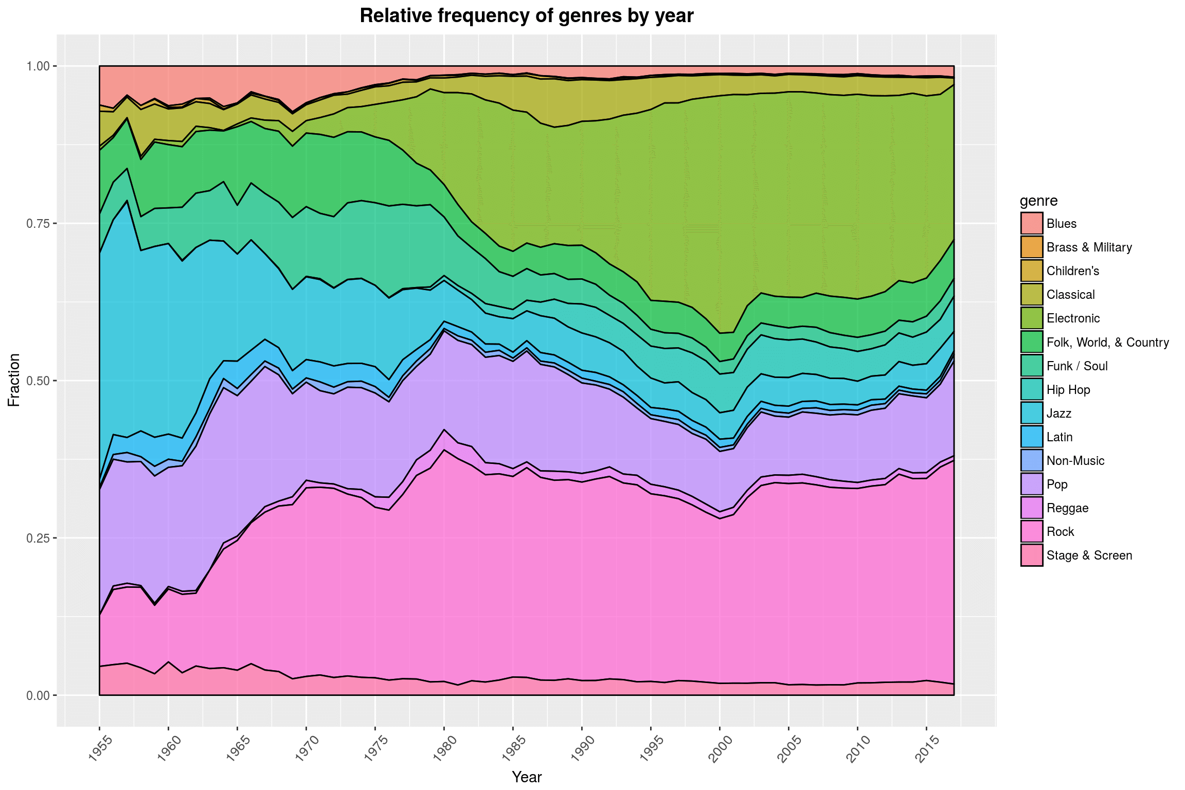 This plot shows the fraction of releases per year that were tagged with a specific genre. The genres in the database are quite broad and arbitrary, which is mainly down to the fact that Discogs does not want to introduce too many genre tags. Luckily, we also have style data available (see below) that is much more fine-grained. This plot already tells many stories on its own using just the rough genre tags: the decline of Jazz in favor of noisy Rock music produced by young savages, a boom of Electronic music in the late 70s and early 80s, and the genesis of hip-hop, just to name a few.
I often hear that people dislike area plots like this one, because they are hard to read, but for exploratory purposes, I am a big fan. Sure, this one has a few color issues and (if anything) shows that certain genre tags in the source databases I am using are very much underrepresented, yet I still find it very pleasing to look at.
Common Musical Styles
Besides genres, my source databases also list styles. These are more refined genres and a release may be tagged with multiple styles. Also, there are many many more styles than genres, 486 of them to be exact. I generally find them more useful and fun than genres, so that’s what we’ll stick with for the next few plots.
Here is a simple, but fun plot: The (absolute) frequencies of the styles, with an unlikely front runner.
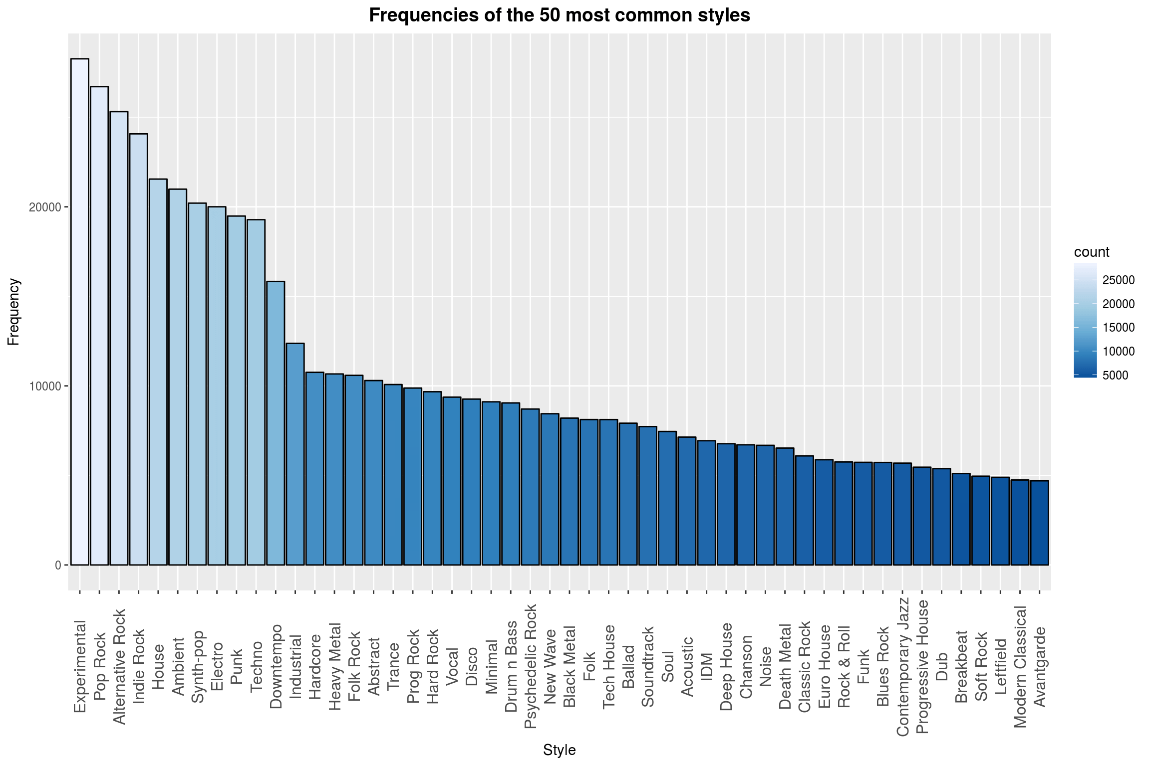 Quite a surprise to see Experimental ranked first. Maybe fans of experimental music are more likely to enter their favorite music into a database or experimental is a catch-all term for music made by people who have no idea of how to make proper music (these people will naturally always be in the majority).
Style Lifetimes
Here are my absolute favorite plots from my submission. I wanted to get a better idea of how single styles developed over time and experimented with ways to visualize it. I ended up separating the releases by styles and plotting the distribution per style as a violin plot, combining related styles into a single plot. This means that the size of the violins per genre are not to scale (relative to each other). To make up for that, the total number of releases for a subgenre is displayed on the right of each violin plot. The colors for the genres do not convey any more information, but are pretty to look at:
 Add some landmark releases to it per genre and I think you would have a pretty cool poster! I know, I should not indulge in praising my plot too much BUT LOOK AT THAT BEAUTIFUL PLOT. I honestly love it.
The particularly attentive reader will note that, surprisingly, the first Black Metal release is set sometimes in the early 1970s, when the term Black Metal did not even yet exist (this is less surprising as soon as you realize that people retroactively tag releases with their modern-day tags). It is also noteworthy that Black Metal is actually ranked 26th among most common styles in the database. I have various explanations for that: First, the equipment needed to record Black Metal albums is among the most minimalist that you could expect; a certain Norwegian act proved in the early 90s that a headset is sufficient to record a beloved cult classic. Second, the picture of an overzealous long-haired young man making it his life’s task to enter every ever-so-obscure Black Metal release into an internet database seems surprisingly reasonable to me (compared to, say, Pop Rock).
The plots for Speed Metal, Folk Metal, and Nu Metal on the other hand shouldn’t raise any questions and are absolutely what I would have expected (which is reassuring that this dataset might actually relate to reality at all!). At this point, I would like to also formally apologize that Metalcore is included in this plot, even though we can surely all agree that this is not metal by any definition, whereas Thrash as in Thrash Metal is missing. That’s what you get for using a simple *metal*-regex…
The full submission has this kind of plot for multiple genres (see Release distributions over time by subgenre). Here is another one, for Jazz this time:
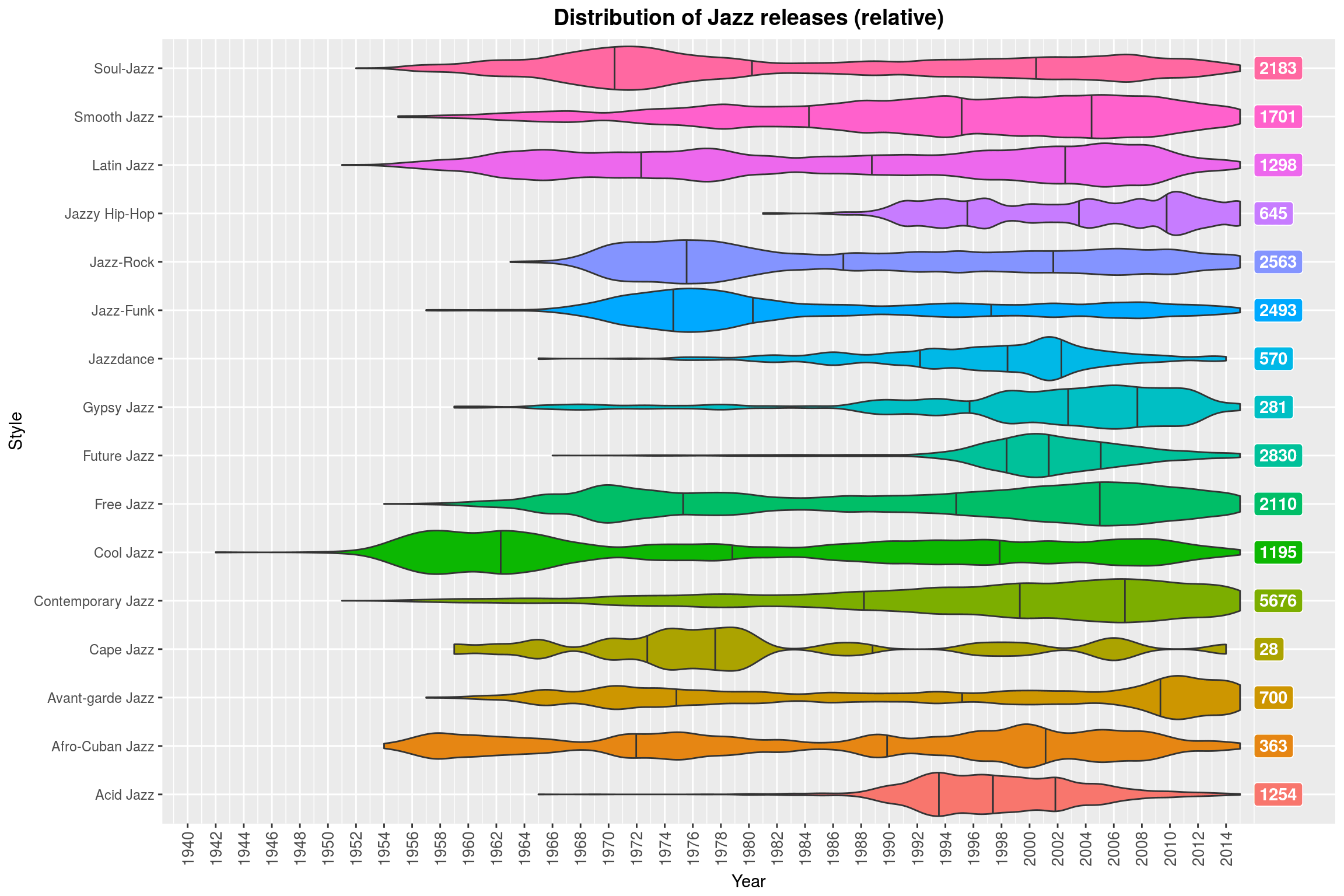 You can clearly see that Future Jazz is a thing of the past and that Contemporary Jazz has been contemporary for the last 40 years.
Track Lengths by Position
This may sound like a boring topic, but it was very important to me to collect the lengths of the tracks that are found on each release. I wanted to do something about the tracks and there are really only two things that are broadly available: The song’s name and its length. With names, one could look for the most common words and try to cluster them by theme, which also seems like an immensely interesting project, but I went for song lenghts because I happen to like long songs (15min+) with unusual structure.
Here is my favorite plot from this part of the analysis:
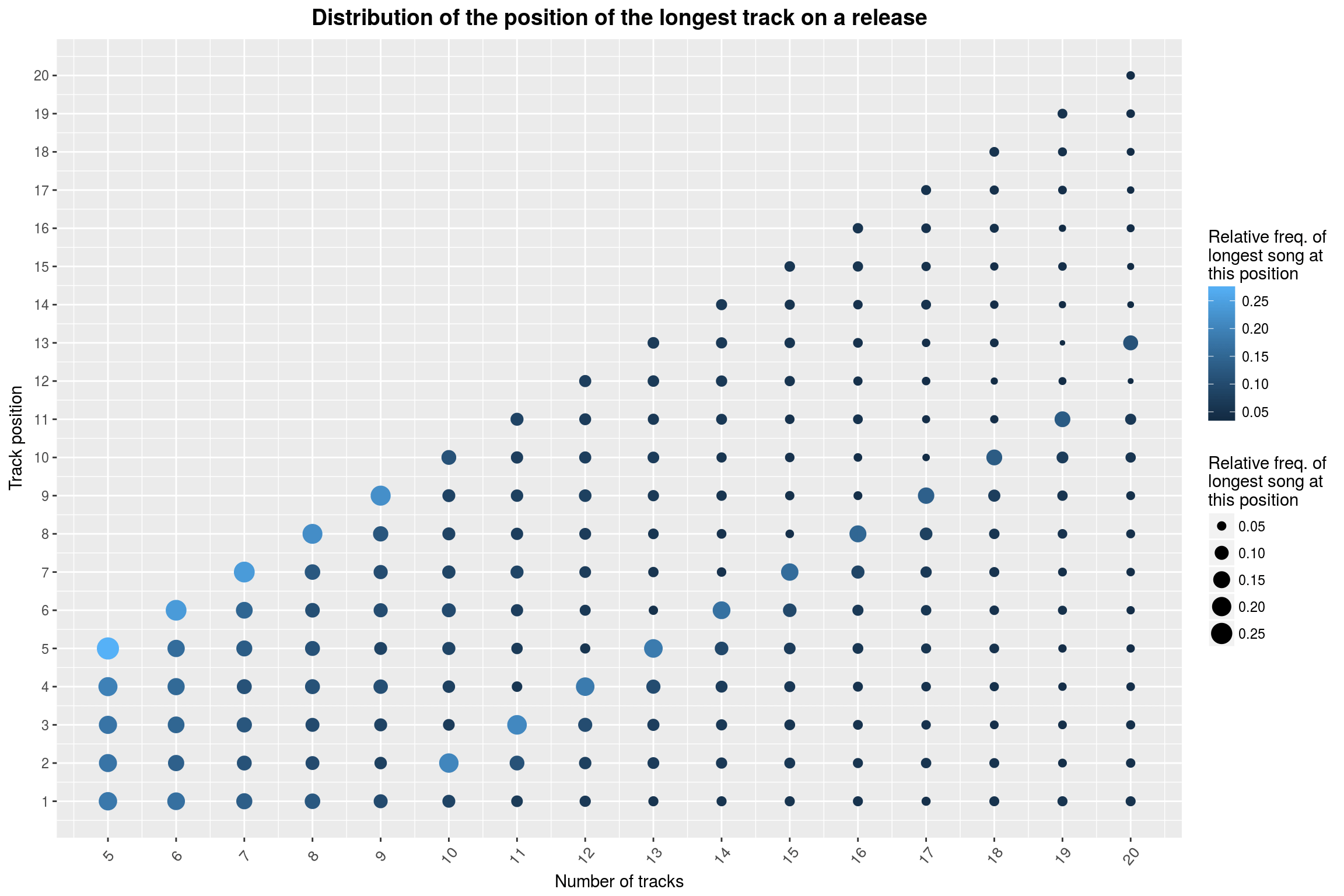 What you are seeing is the distribution of the longest track on a release, split by the total number of releases. The first column shows 5-track releases; the color and size of the circles encode how frequently a track at the indicated position is the longest track of the release.
In case you have not noticed it by now: It seems that for releases with less than 10 tracks, the longest track is usually the last one. After that, something really weird happens: The longest track of the release is predominantly on the 8th-to-last position of the release, until you get to 20 track release where things shift again. This is a phenomenon that really should be looked into more rigorously. I have spent quite some time looking for mistakes on my part and structural biases in the dataset that could explain this weirdness, but I have not been able to come up with anything.
Conclusion
I hope you found these plots as interesting, enlightening, or beautiful as I did. It was great fun and very fulfilling to set them up. I would love to return to this dataset one day for an extended analysis (this time in python, not in R!). With this dataset, the questions are just popping up left and right. It’s been a year and I still come up with things I didn’t look into (like whether the average track length is different between CD releases and Vinyl releases).
(One day I may find the time to clean up the scripts that produced this dataset, making it available to the public.)
If you are still up for more, take a look at the full submission to find out…
- what the average lifetime of a band is,
- where most of the bands in the database come from,
- how the gender distribution among artists changed over the last 65 years,
- whether the average song length shifted over time,
- and much more.
So long and thanks for reading :)
-
Both databases distinguish between release groups/masters and actual releases. For example, the release group Abbey Road is associated with many releases, such as the Spanish 1969 12” Vinyl release of the album. I am using release for release group, because I am more interested in the abstract albums than their various physical implementations. ↩